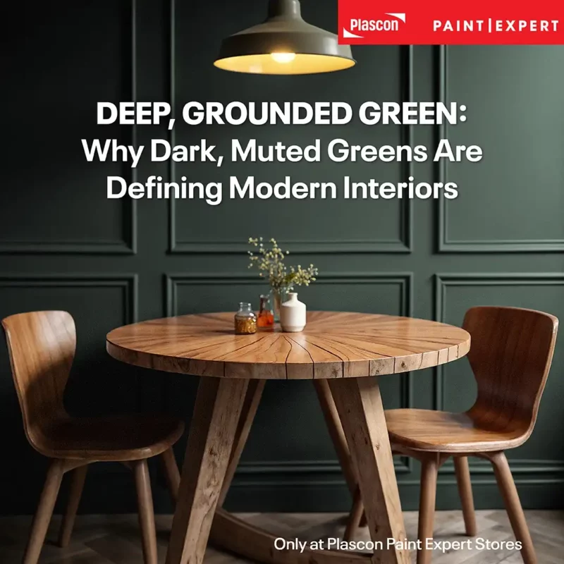
Deep, muted greens are becoming a dominant interior design trend because they create calm, grounded spaces that feel connected to nature. These tones add depth without visual noise and pair effortlessly with natural materials. When used thoughtfully – on feature walls or through colour drenching – they deliver a sophisticated, timeless interior direction.
Introduction
Walk into enough well-designed spaces today – locally or internationally and a pattern starts to emerge. The colours are quieter. Less decorative. More deliberate.
Deep greens are showing up again and again.
Not the bright, botanical greens of a few years ago, but darker, more complex versions. Greens that sit somewhere between olive, charcoal, and forest. Greens that don’t demand attention, but instead hold a space together.
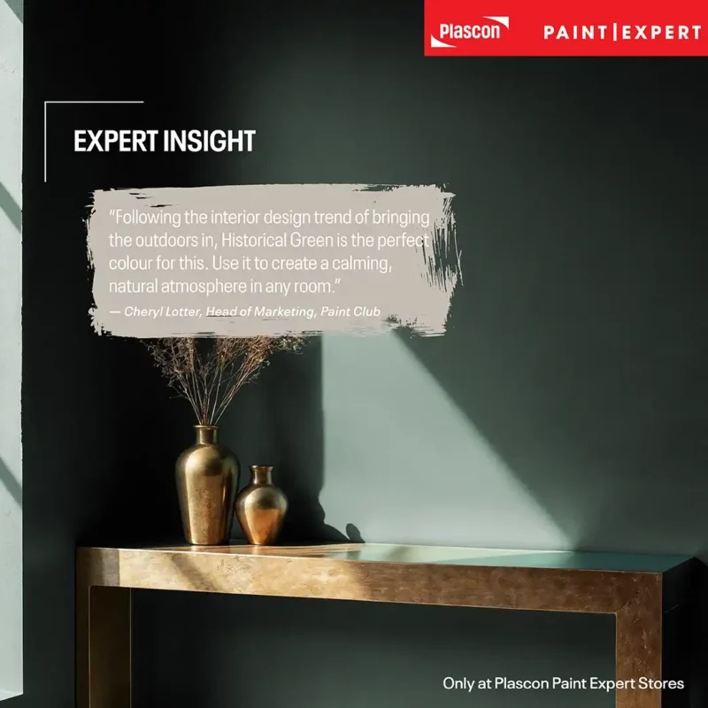
As Cheryl Lötter, Head of Marketing at Paint Club, explains:
“Following the interior design trend of bringing the outdoors in, Historical Green is the perfect colour for this. Use it to create a calming, natural atmosphere in any room.”
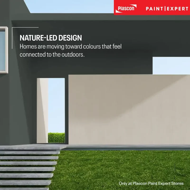
That shift toward nature-led interiors reflects a broader global movement shaping how people want their homes to feel.
The Global Move Toward Grounded, Nature-Led Interiors
Interior design is increasingly moving toward grounded, nature-inspired palettes as people prioritise calm, comfort, and emotional wellbeing in their homes.
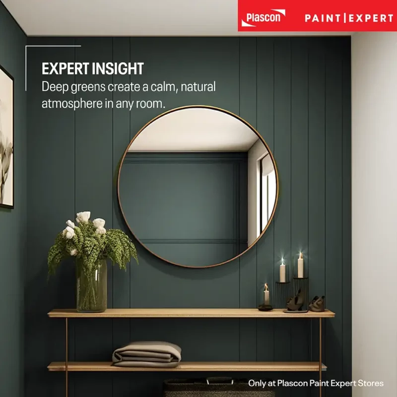
This direction is strongly influenced by biophilic design – an approach that integrates natural elements into interior spaces. Colour plays a central role in achieving this.
Instead of high-contrast schemes, designers are favouring:
- Earth-based tones
- Reduced colour saturation
- Materials that feel organic and tactile
- Pinterest trend report highlighting “nature-inspired interiors”: https://business.pinterest.com/pinterest-predicts/
This is less about aesthetic novelty and more about how spaces make people feel.
What Makes Deep Green Different from Other Dark Colours
Deep green behaves like a neutral, but with more warmth and complexity than grey or black.
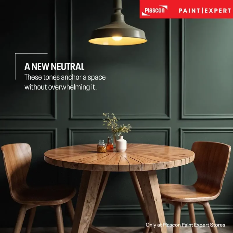
Unlike flat greys, these tones carry layered undertones – often olive, brown, and charcoal – which allow them to adapt to different environments. They absorb light more softly, sit comfortably alongside warm materials, and create contrast without feeling harsh.
Where black can feel severe and grey can feel cold, green introduces a subtle connection to the natural world. That connection often registers instinctively, before it’s consciously recognised.
How This Trend Translates into Real Spaces
This trend typically appears in two distinct but related approaches: controlled contrast and immersive design.
Feature Walls: Depth Without Commitment
A deep green feature wall introduces contrast while anchoring the room visually.
Thinking about introducing deep green as a feature wall? Use our Colour Visualiser to see how the shade could look in your own room before you paint.
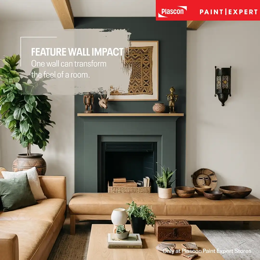
It works particularly well:
- Behind a bed
- In living rooms behind a TV or shelving
- In dining areas where atmosphere matters
Balance remains essential. Lighter surrounding surfaces prevent the space from feeling closed in, while furniture and lighting help ground the darker tone.
Colour Drenching: Immersive Design
Colour drenching – using the same colour across walls, trims, and sometimes ceilings -creates a cohesive, enveloping environment.
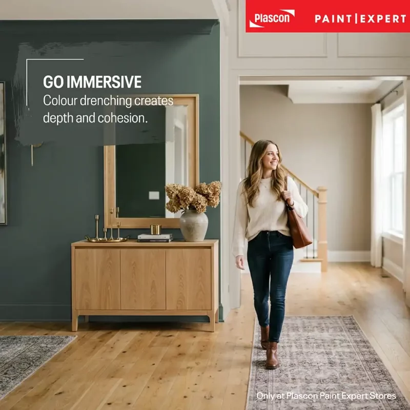
In these spaces, visual interest shifts away from colour contrast and toward texture.
Wood grain, textiles, and finishes like leather or metal take on a more prominent role. This approach is widely seen in international interiors, particularly in boutique hospitality and high-end residential design.
https://www.littlegreene.eu/advice-hub/embracing-colour-drenching
The Role of Materials in Making Deep Green Work
Materials are what determine whether a deep green interior feels warm and inviting or heavy and flat.
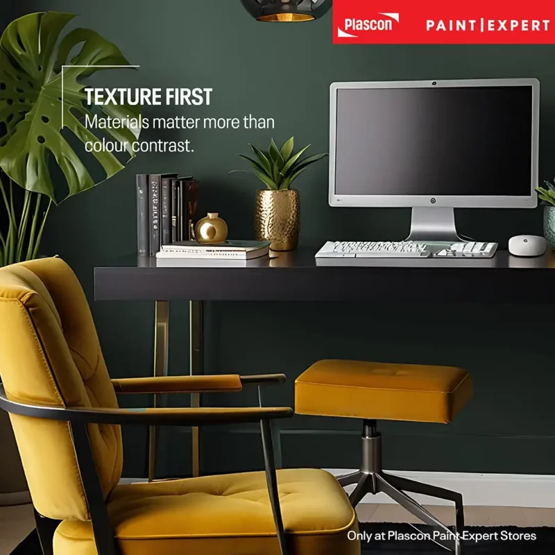
Because the colour itself is restrained, surfaces and finishes need to carry more of the visual weight.
- Blond oak introduces lightness and prevents the palette from becoming too dense
- Brushed brass adds warmth and subtle reflection
- Camel-tone leather brings richness and bridges natural tones
These combinations feel cohesive because they mirror natural environments – wood, earth, foliage – which creates a sense of visual harmony.
African Context: Why This Palette Feels So Natural Locally
Deep greens sit comfortably within South African interiors because they align with existing material and design preferences.
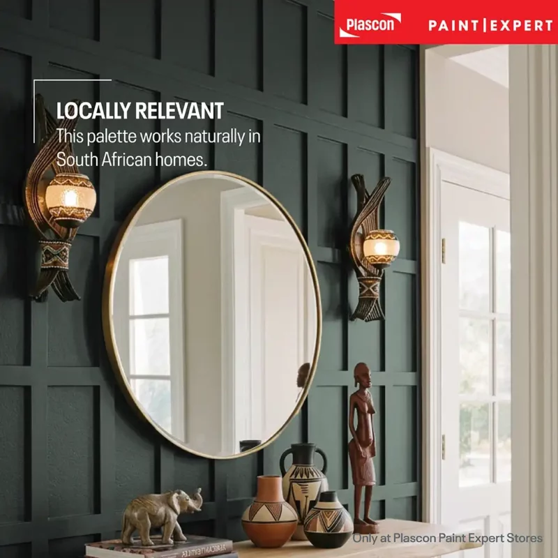
Many local spaces already incorporate:
- Timber
- Natural fibres
- Handcrafted décor
- Layered textures
A darker green backdrop allows these elements to stand out more clearly. Woven textures gain contrast, artwork becomes more prominent, and the overall space feels grounded rather than styled.
Pattern and Layering: The Wallpaper Approach
Pattern is being used more selectively, often within a tight tonal range rather than through bold colour contrast.
Instead of introducing multiple colours, designers are layering pattern within the same palette – often through botanical or tropical wallpapers that reinforce the natural theme.
The most effective spaces keep the structure simple:
- One dominant green tone
- One patterned feature
- Minimal competing colours
This creates cohesion without sacrificing visual interest.
Lighting: The Factor That Changes Everything
Lighting has a significant impact on how deep greens are perceived.
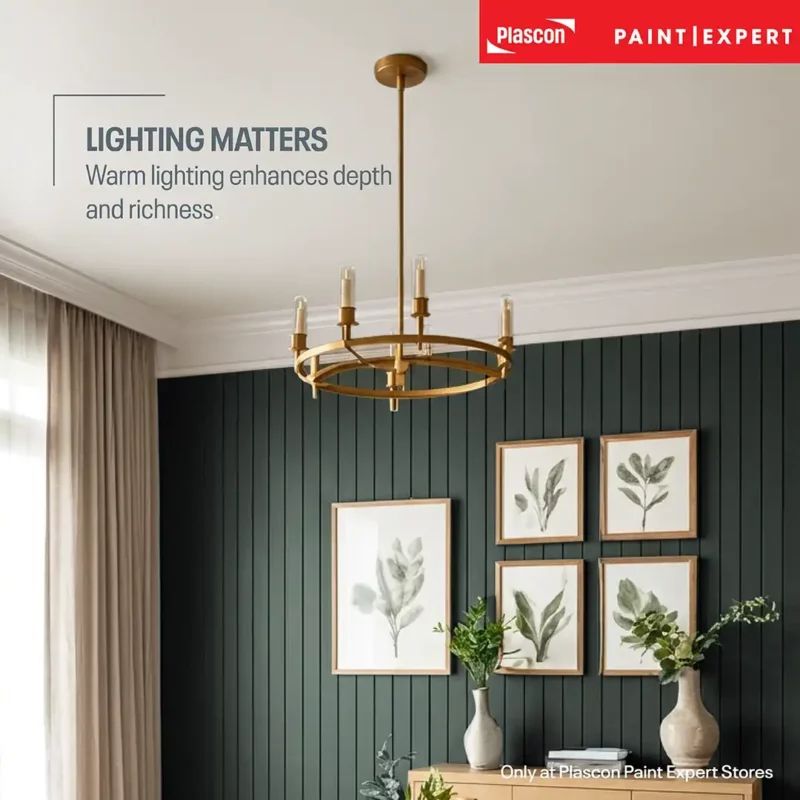
These colours respond strongly to both natural and artificial light:
- Warm lighting enhances olive undertones
- Cool lighting can flatten the colour
- Layered lighting prevents shadow-heavy areas
In South African homes, strong daylight tends to work in favour of deeper colours during the day. In the evening, warmer lighting becomes essential to maintain the intended mood and depth.
Because deep greens can look different depending on the room and its lighting, try the shade in your own space with our Colour Visualiser before making your final colour choice.
Where Specific Colours Fit Into This Trend
While the trend extends beyond any single product, certain colours align closely with this direction.
Historical Green (PEX-A-010) reflects the move toward deep, muted greens with a smoky, grounded quality.
When paired with a warm neutral like Natural Linen (PEX-N-004), the palette feels balanced and easy to live with – particularly in spaces that rely on natural materials and layered textures.
Want to see how Historical Green could work in your home? Visualise the colour in your own room and experiment with the look before committing to the final scheme.
Paint Club Bespoke Colour Collection
Practical Tips
- Start with a single surface before committing to a full-room application
- Use texture instead of additional colours to create variation
- Test colour in real lighting conditions throughout the day
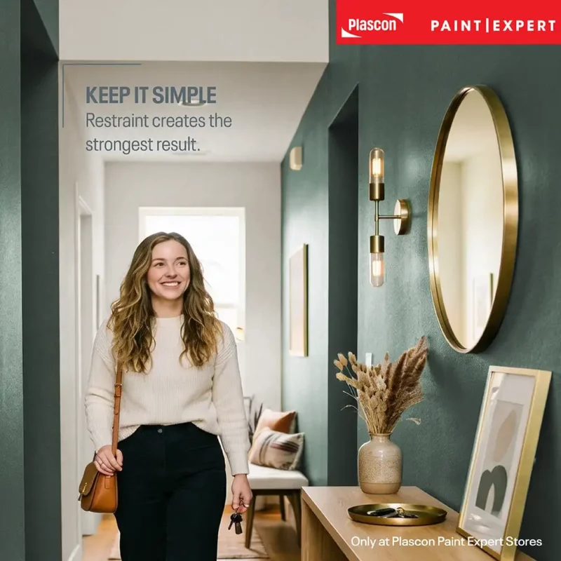
- Keep the palette restrained for a more cohesive result
- Use warm, layered lighting to enhance depth
Common Mistakes
- Pairing deep green with stark, cool whites
- Using too many dark finishes in one space
- Ignoring how lighting changes the colour
- Introducing too many competing tones
- Treating the colour as decorative rather than foundational
Key Takeaways
- Deep greens reflect a global move toward nature-led interiors
- They function as grounding neutrals with added depth
- Texture and material become more important than colour contrast
- Lighting plays a critical role in the final result
- The most successful spaces rely on restraint and cohesion
FAQs
- Why are dark greens trending internationally?
They align with biophilic design and a growing focus on calm, nature-inspired interiors. - Do deep greens work in bright climates like South Africa?
Yes, they balance strong natural light and add depth. - Are feature walls still relevant?
Yes, particularly for introducing darker colours in a controlled way. - What is colour drenching?
Using one colour across multiple surfaces to create an immersive space. - Does dark green make a room feel smaller?
Not necessarily—when balanced correctly, it often adds depth instead. - What materials work best with deep green?
Timber, leather, brass, and natural fibres. - Is this trend long-term or short-term?
It aligns with longer-term shifts toward natural, grounded living. - Can I combine green with wallpaper?
Yes, especially tonal or botanical patterns. - Where can I buy Historical Green and Natural Linen?
Historical Green (PEX-A-010) and Natural Linen (PEX-N-004) are exclusively available from Paint Club and authorised Plascon Paint Expert stores nationwide. You can find your nearest store here:
https://paintexpert.co.za/directory/
Disclaimer
Colour appearance may vary depending on lighting, materials, and surrounding finishes. Always test before final application.