By Cheryl Lotter, Paint Club Head of Marketing and paint industry specialist with 20 years of experience
Quick Answer
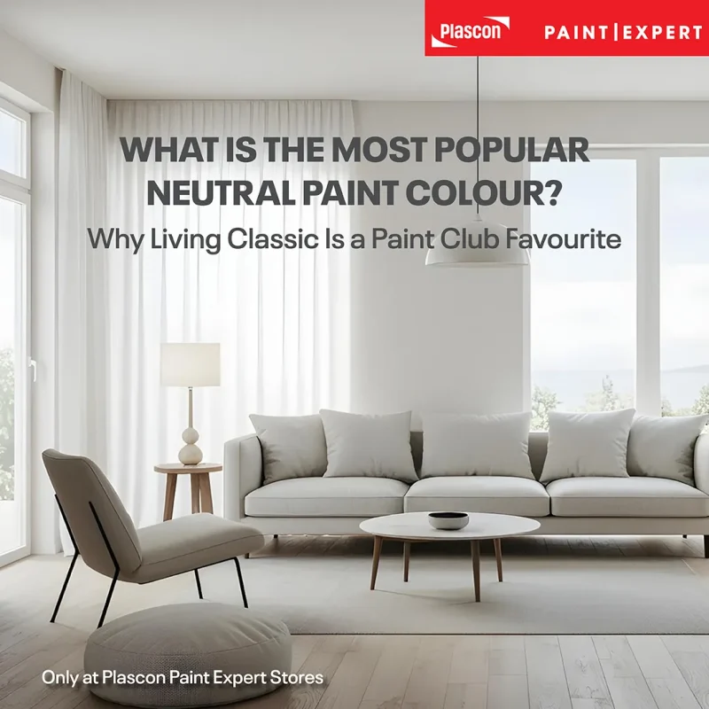
There is no single neutral paint colour that is universally the most popular, as the right choice depends on lighting, fixed finishes and personal style. Living Classic (PEX-N-001) is one of Paint Club’s most popular neutrals because its pale grey appearance and soft beige undertones create a versatile backdrop for interior, exterior and whole-house colour schemes.
A Neutral That Makes the Whole House Easier to Decorate
Choosing one paint colour for several rooms can be surprisingly difficult. The shade needs to work with changing light, different flooring, existing furniture and the individual character of each space. It must also create continuity without making the home feel repetitive.
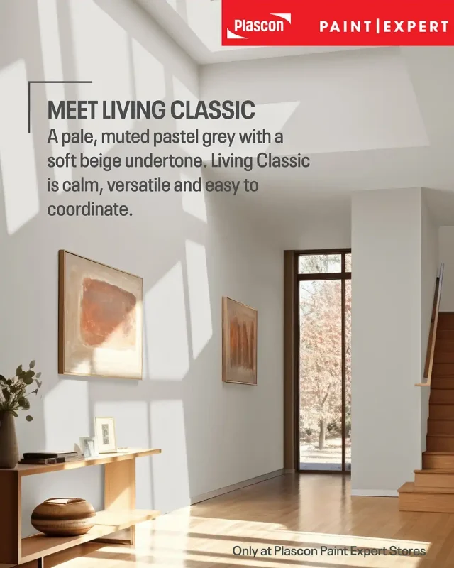
Living Classic (PEX-N-001) was developed for exactly this kind of application. As one of Paint Club’s most popular neutrals, it offers the clean, contemporary quality of pale grey, softened by a subtle beige undertone. This balance gives the colour warmth and makes it easier to live with than a cooler, blue-based grey.
The result is a versatile backdrop that feels simple, considered and timeless. Living Classic can sit quietly behind colourful artwork and patterned textiles, or form part of a restrained palette of timber, stone, linen and layered neutrals.
“Living Classic is the kind of colour people return to because it removes much of the uncertainty from choosing a whole-house neutral,” explains Cheryl Lotter, Head of Marketing at Paint Club, who has worked in the paint industry for 20 years. “It gives you flexibility. You can change your furniture, artwork or accent colours over time without needing to rethink the entire home.”
Paint Club Bespoke Colour Collection
What Colour Is Living Classic?
Living Classic is a light pastel grey with muted colour intensity and a soft beige undertone. In design terminology, it falls into the warm-grey or “greige” family, although its overall appearance remains closer to a pale grey than a definite beige.
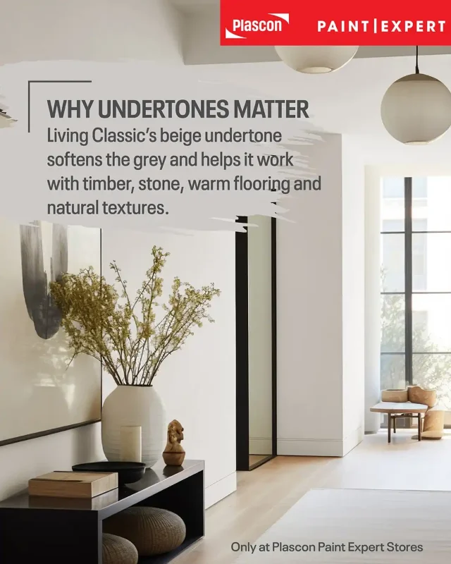
That undertone matters. A grey with strong blue or violet undertones can appear cold in certain rooms, particularly when paired with warm flooring, cream tiles or yellow-toned timber. Living Classic’s beige influence helps it connect more comfortably with these warmer permanent finishes.
Its muted character is equally important. A highly saturated colour immediately attracts attention, while a muted colour tends to settle into the background. This allows architectural details, furniture, artwork and natural materials to carry more of the visual interest.
Expert Insight
An undertone is the less obvious colour beneath a paint colour’s main appearance. Undertones become easier to see when a colour is placed beside white, flooring, cabinetry or another neutral.
Paint Club recommends testing a colour in the actual room because natural light, artificial lighting and reflections from surrounding surfaces can change how it appears. A paint colour should be viewed during the day and at night before a final decision is made. Paint Expert’s colour-selection guidance explains why sampling is one of the most reliable ways to identify unexpected undertones.
Why Living Classic Works as a Whole-House Colour
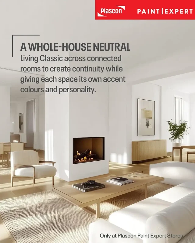
Living Classic works well throughout a home because it creates visual continuity while allowing each room to develop its own identity. The wall colour remains consistent, but furniture, textiles, artwork and accent colours can change from one area to the next.
This approach is particularly useful in open-plan South African homes, where kitchens, dining rooms, lounges and entrance areas are often visible at the same time. Too many unrelated wall colours can fragment these connected spaces. Repeating Living Classic creates a calmer visual journey.
It also simplifies future decorating decisions. A child’s bedroom may use brighter accents, while the main bedroom could feature timber, linen and soft greens. The lounge might lean towards charcoal, leather and bold South African artwork. Living Classic can support all three schemes without looking out of place.
Practical Tip
Use Living Classic as the connecting colour in passages, entrance halls and open-plan living areas. Introduce stronger shades in bedrooms, bathrooms, cabinetry or selected feature walls.
This creates flow without requiring every room to look the same.
How Living Classic Responds to Light
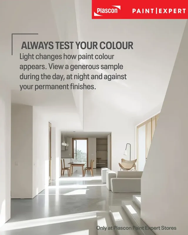
Light can make Living Classic appear warmer, cooler, lighter or slightly deeper. The colour itself does not change, but the way the eye perceives it is influenced by the type and direction of light in the room.
In a bright, naturally lit space, Living Classic is likely to appear light, fresh and softly grey. Warmer artificial lighting may emphasise its beige undertone, while cooler lighting can bring the grey forward.
Reflected colour can also influence the result. Greenery outside a large window, red brick paving, timber floors and colourful curtains can all cast subtle reflected tones onto a pale wall.
Best Practice
Brush out a generous sample rather than judging Living Classic from a small printed colour chip or digital screen. Paint the sample on more than one wall and examine it in morning light, afternoon light and under the room’s normal artificial lighting.
Digital visualisation is useful for narrowing down choices, but screen settings cannot reproduce paint colour with complete accuracy.
Visualise Living Classic in Your Own Space
The Paint Club Colour Visualiser helps you explore Living Classic and other colours in the Paint Club range using a photograph of your own room. It provides a useful first impression of how different colours could influence the space before you narrow down your choices and test physical samples.
Upload a photograph from your phone or choose an image from the Visualiser’s room library. The tool identifies paintable surfaces, allowing you to apply Living Classic to the walls or ceiling and compare it with alternative colours.
This is particularly helpful when planning a whole-house scheme. You can see how Living Classic might work in a lounge, bedroom, kitchen or open-plan area, then experiment with stronger Bespoke Collection colours on feature walls or adjoining surfaces.
Try combinations such as:
- Living Classic with Endless Sea (PEX-A-004)
- Living Classic with Pennygum (PEX-A-009)
- Living Classic with Historical Green (PEX-A-010)
- Living Classic with Vincent (PEX-B-005)
- Living Classic with Delft (PEX-B-008)
- Living Classic with Joker (PEX-N-008)
You can save and share your visualised space, making it easier to compare options or discuss your shortlist with family, a decorator or the colour specialists at your nearest Plascon Paint Expert store.
Practical Tip: Use the Colour Visualiser to narrow down your preferred palette, then brush out physical samples in the actual space. Digital visualisation is a planning aid, while a painted sample will show how the colours respond to your lighting, flooring, furniture and surrounding finishes.
Visualise Living Classic in your space with the Paint Club Colour Visualiser
Using Living Classic in Interior Spaces
Living Classic can be used on main walls, ceilings, cabinetry and selected architectural details, provided the appropriate coating is chosen for the surface. The colour gives interiors a quiet foundation without dictating one specific decorating style.
In a contemporary home, pair it with black accents, simple furniture and pale timber. For a classic interior, combine it with deeper wood tones, detailed furniture and crisp trim. Coastal schemes can introduce blue, woven fibres and light woods, while more eclectic rooms can layer artwork, antiques and stronger colour against the neutral background.
The finish and product matter as much as the colour. A washable interior wall coating may be appropriate for busy family areas, while cabinetry and trim require a coating designed for those surfaces. The Bespoke Colour Collection can be tinted into selected Plascon products, including Double Velvet for interior walls and Velvaglo Water-Based Enamel for trim and cabinetry. Availability and suitability should be confirmed with a Plascon Paint Expert store. The Paint Club Bespoke Colour Collection provides an overview of the collection and compatible product categories.
Using Living Classic on Exterior Walls
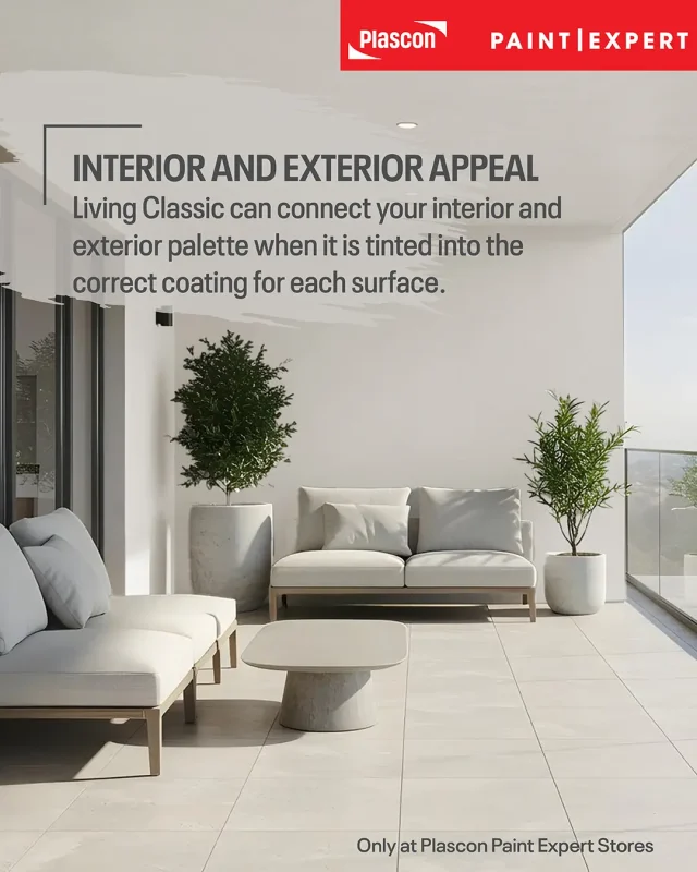
Living Classic is also an excellent colour choice for exterior schemes when tinted into an appropriate exterior coating. Its pale, muted character works with a wide range of roofing materials, paving colours, boundary walls and architectural styles.
For a crisp exterior, pair it with white trim and charcoal details. Timber doors and warm stone will draw out its beige undertone, while slate-coloured roofing can emphasise the grey.
Exterior colour should always be assessed outdoors. Strong sunlight can make pale colours look considerably lighter than they appear indoors, while shaded walls may reveal more of the undertone.
Paint Club lists Plascon Wall & All and Plascon Micatex among the exterior products into which colours from the collection may be tinted. Product selection must still take account of the substrate, condition of the surface, required finish and exposure. Consult a Plascon Paint Expert before specifying a coating.
Colours to Pair with Living Classic
Living Classic can support tonal neutrals, earthy midtones and confident brights. The best pairing depends on how much contrast the room needs and which fixed materials are already present.
All the named colours below form part of the exclusive Paint Club Bespoke Colour Collection.
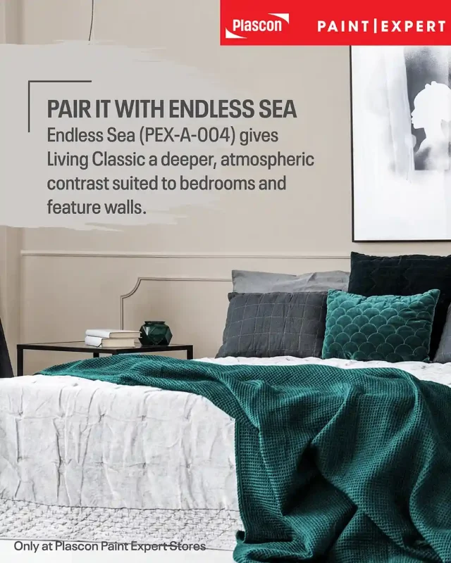
Living Classic and Endless Sea
Endless Sea (PEX-A-004) gives Living Classic a deeper, more atmospheric companion. Use it for a bedroom feature wall, a painted cabinet or a defined area within an open-plan home.
The contrast remains sophisticated because the soft neutral allows the accent colour to carry the room without competing against it.
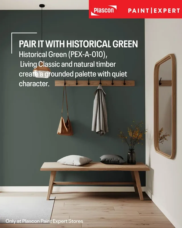
Living Classic and Historical Green
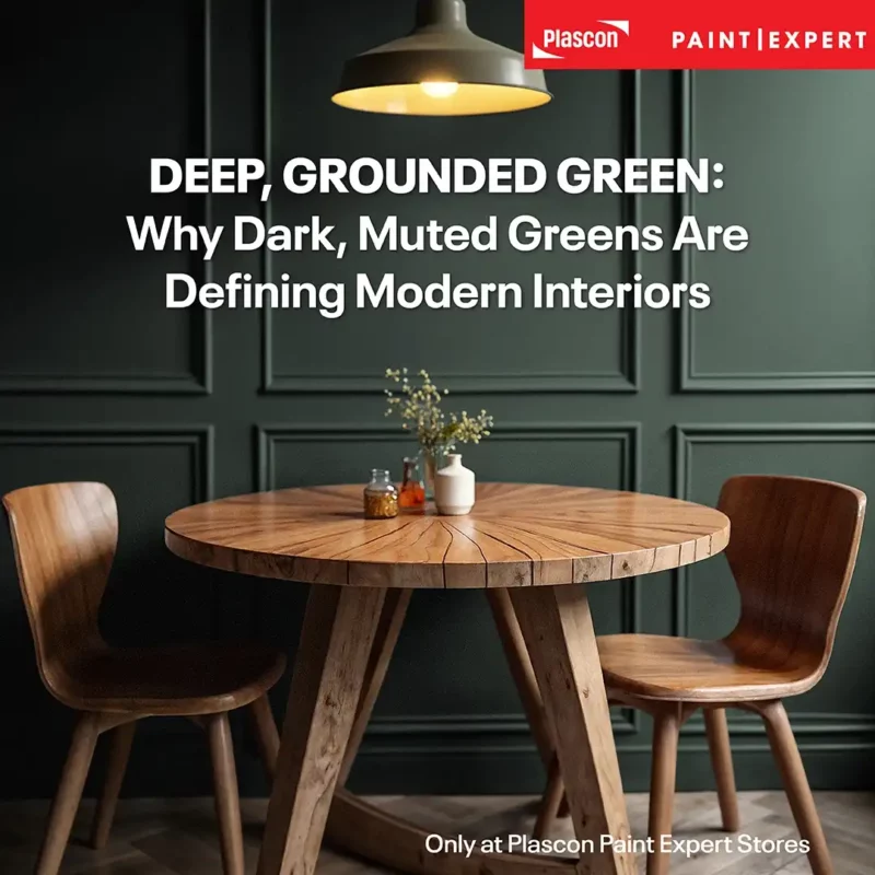
Historical Green (PEX-A-010) creates a grounded, nature-influenced palette. It is especially effective with timber, indoor plants, woven materials, stone and aged metallic finishes.
This combination suits living rooms, studies, bathrooms and kitchens where a calm but distinctive scheme is required.
Living Classic and Pennygum
Pennygum (PEX-A-009), Paint Club’s Colour of the Year for 2026, introduces an earthier South African influence. Living Classic gives Pennygum room to make an impression while maintaining a balanced overall scheme.
Consider Pennygum on a feature wall, front door, built-in unit or selected architectural element.
[SUGGESTED INTERNAL LINK: Pennygum Colour of the Year Article]
Living Classic and Delft
Delft (PEX-B-008) creates a stronger, more expressive contrast. It can be introduced through a feature wall, cabinetry or smaller painted details, particularly in rooms that already contain blue ceramics, patterned fabrics or striking artwork.
Living Classic prevents the deeper colour from overwhelming the room and gives the eye a place to rest.
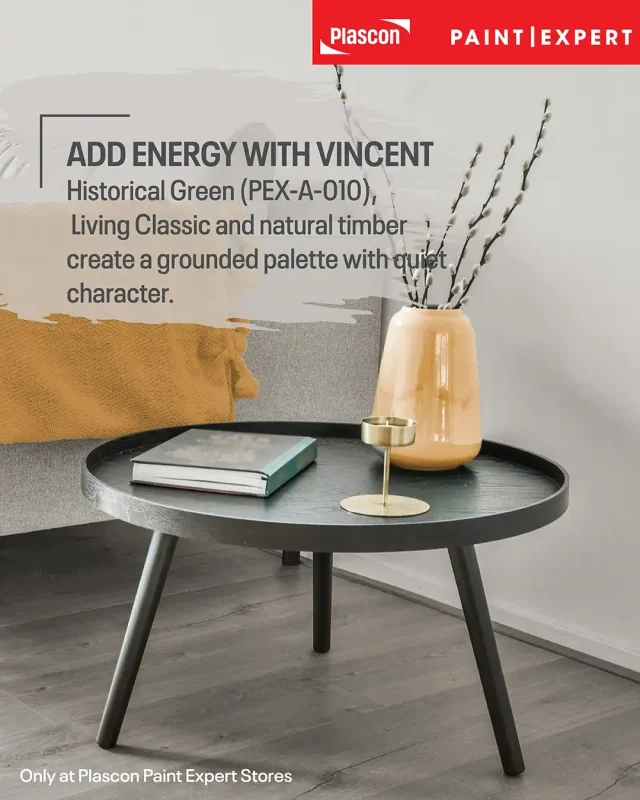
Living Classic and Vincent
Vincent (PEX-B-005) brings warmth and energy to a Living Classic scheme. Because Vincent is visually stronger, it works well in controlled amounts through a painted niche, small furniture item or decorative detail.
The pairing is useful when a mostly neutral interior needs a more confident point of focus.
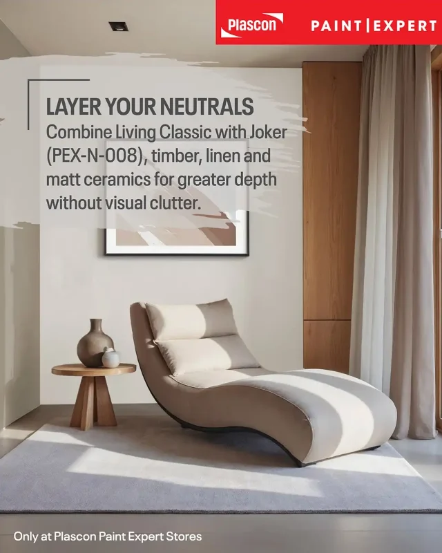
Living Classic and Joker
Joker (PEX-N-008) creates a layered neutral palette with greater depth. Use Living Classic on the main walls and Joker on shelving, cabinetry or a feature surface.
This pairing can be strengthened with black details, raw timber, textured fabric and handmade ceramics.
Living Classic with Other Soft Neutrals
True Ivory (PEX-N-002), Natural Linen (PEX-N-004) and Sandy Toes (PEX-N-005) can be used alongside Living Classic to build a gentle tonal scheme. The differences may be subtle, so samples should be compared together in the intended space before committing.
Layered neutral palettes rely on texture and material variation. Linen, timber, stone, boucle, woven fibres and matt ceramics stop the room from appearing flat.
Practical Tips for Decorating with Living Classic
Tip 1: Start with the permanent finishes
Compare Living Classic with flooring, tiles, countertops and fixed cabinetry. These elements are generally more costly to replace than paint.
Tip 2: Test a large sample
A small colour chip cannot show how the shade will behave across an entire wall. Test it in the actual room and examine it at different times of day.
Tip 3: Compare whites carefully
Very cool white trim may emphasise the warmth in Living Classic. A softer white can create a gentler transition. Test the two colours side by side.
Tip 4: Add contrast deliberately
If the scheme feels too pale, introduce depth through darker cabinetry, furniture, doors, artwork or one of the Bespoke Collection accent colours.
Tip 5: Use texture in neutral rooms
Layer timber, woven fabrics, stone, ceramics and natural fibres. Texture gives a restrained colour palette richness and character.
Tip 6: Choose the coating for the surface
The same colour can be used across different surfaces, but walls, exterior masonry, trim and cabinetry may require different products and preparation systems.
Common Mistakes When Using a Pale Neutral
Choosing from a Screen Alone
Screens, photography and device settings can alter colour. Use digital tools for inspiration and narrowing down options, then confirm the colour with a physical sample.
Ignoring Existing Undertones
Cream tiles, cool grey floors, red-toned timber and stone can each affect how Living Classic is perceived. Compare the sample directly against the finishes it must work with.
Using Too Many Similar Neutrals
Several pale neutrals with conflicting undertones can make a room feel slightly disjointed. A more coherent approach is to repeat Living Classic and create variation through texture, finish and controlled accent colours.

Forgetting About Contrast
A room in which the walls, furniture, curtains and flooring are all similarly pale can lose definition. Add darker or more saturated elements to establish visual structure.
Specifying Colour Without Confirming the Product
Colour and coating performance are separate decisions. Select an interior or exterior product designed for the substrate and conditions, then have Living Classic tinted into that suitable product.
Key Takeaways
- Living Classic (PEX-N-001) is a pale, muted pastel grey with soft beige undertones.
- It is one of Paint Club’s most popular neutral colours.
- Its balanced undertone makes it suitable for a wide range of furniture, flooring and decorating styles.
- Living Classic is particularly effective as a whole-house colour because it creates continuity between rooms.
- It can form part of interior and exterior colour schemes when tinted into the correct product for the surface.
- Strong Bespoke Colour Collection pairings include Endless Sea, Historical Green, Pennygum, Delft, Vincent and Joker.
- Physical sampling remains essential because light and surrounding finishes influence how every paint colour appears.
- Product choice, surface preparation and colour choice should be considered together.
Frequently Asked Questions
- What type of colour is Living Classic?
Living Classic (PEX-N-001) is a pale, muted pastel grey with a soft beige undertone. This gives it a warmer and more adaptable appearance than many cool blue-based greys.
- Is Living Classic a warm or cool grey?
Living Classic leans warm because of its soft beige undertone. Lighting and surrounding materials can still make it appear cooler or warmer in a particular space.
- Can Living Classic be used throughout an entire house?
Yes. Living Classic is well suited to whole-house colour schemes because it creates continuity and can support different accent colours and decorating styles in individual rooms.
- Can Living Classic be used outside?
Yes, Living Classic can form part of an exterior colour scheme when it is tinted into a suitable exterior paint. Ask a Plascon Paint Expert to recommend the correct product and preparation system for the surface.
- Which Bespoke Collection colours pair well with Living Classic?
Recommended pairings include Endless Sea (PEX-A-004), Pennygum (PEX-A-009), Historical Green (PEX-A-010), Vincent (PEX-B-005), Delft (PEX-B-008) and Joker (PEX-N-008).
- What trim colour works with Living Classic?
Both crisp and softer whites may work, but the best option depends on the room’s lighting and existing finishes. Compare samples of the trim colour and Living Classic directly against each other.
- Does Living Classic work with timber?
Yes. Its soft beige undertone makes it a natural partner for pale, medium and darker timbers. Always compare a sample with the specific timber because wood undertones vary.
- Is Living Classic suitable for a modern interior?
Living Classic works well in modern interiors when paired with clean lines, black or charcoal details, simple furniture and natural materials. It can also support classic, coastal, farmhouse and eclectic schemes.
- Will Living Classic look the same in every room?
No. Natural light, artificial lighting, room orientation and reflected colour from nearby surfaces can all influence its appearance. Sampling in each key area is recommended.
- Where is Living Classic available?
Living Classic is part of the Paint Club Bespoke Colour Collection, which is available exclusively through authorised Plascon Paint Expert stores in the Paint Club network. Visit the Paint Expert store locator to find a participating store.
Disclaimer
Digital colour representations are intended as a guide and may differ from the final painted surface because of screen settings, lighting, substrate, paint product and finish. Always view a physical colour sample and test the colour in the intended environment. Consult a Plascon Paint Expert for product selection, preparation requirements and application guidance.