Quick answer
A restful coastal colour palette combines warm neutrals with soft ocean blues and a deeper accent. Paint Club’s coastal colour capsule pairs Feather Dust and Diana’s Blue from the Bespoke Colour Collection with Plascon’s Dusky Mood (B5-C1-4) and Ocean Crystal (B1-C2-3). Curated by Cheryl, Paint Club’s Head of Marketing and one of its resident Colour Experts, this capsule is exclusively available from authorised Plascon Paint Expert stores nationwide.
Bring your holiday energy home
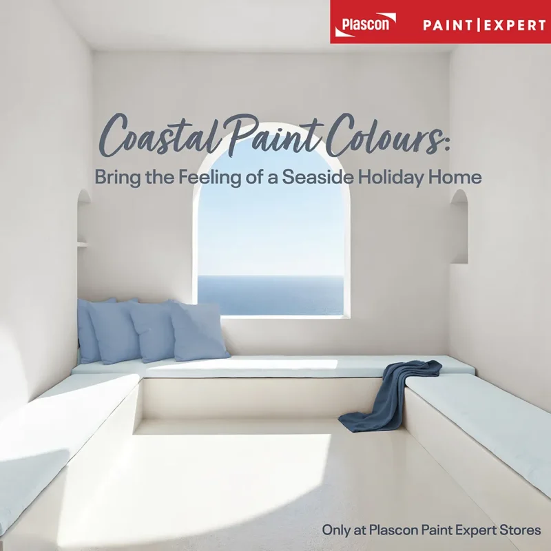
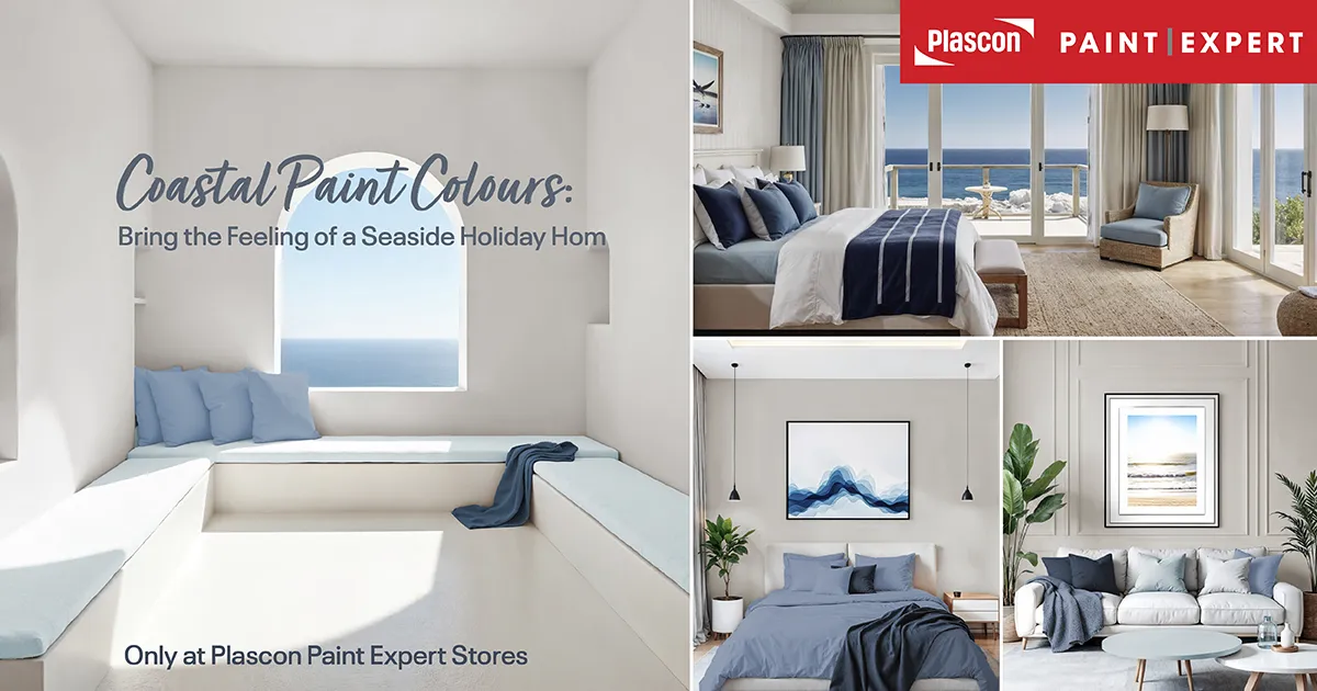
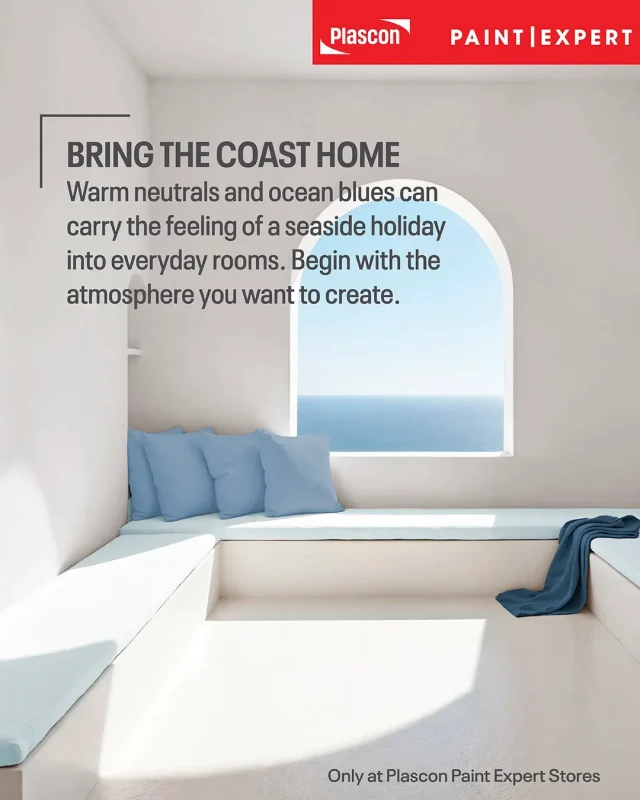
A coastal interior begins with the feeling you want to keep after a holiday: unhurried mornings, bare feet on a cool floor and a comfortable chair beside an open window. Colour provides the backdrop, while texture, space and everyday comforts help carry that feeling into your home.
Feather Dust, Diana’s Blue, Dusky Mood and Ocean Crystal bring together the warmth of sand and the changing shades of water. The palette suits a coastal apartment, a suburban family home or a bedroom in the city where you want a gentler end to the day.
Paint Club prides itself on staying at the forefront of colour trends in South Africa. Cheryl’s selection translates that commitment into an approachable decorating idea: bring your holiday energy home through thoughtful colour combinations and rooms that are comfortable to live in.
Meet the four colours in the coastal capsule
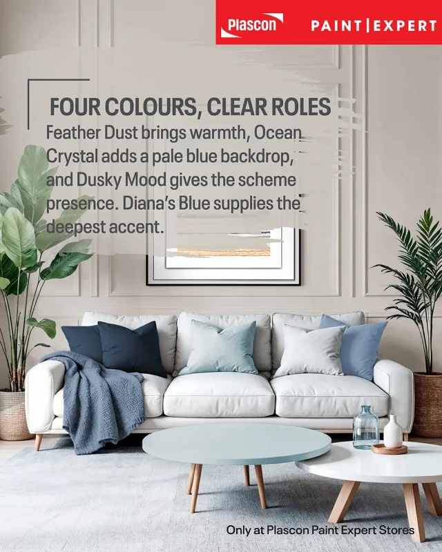
The capsule balances a warm neutral, two softer blues and a deep blue accent. Each shade has a distinct role, so you can build a coherent scheme without giving all four colours equal space.
The descriptions below are styling interpretations of the supplied swatches. Confirm the colours against physical samples before making your final selection.
| Colour | Collection and code | Suggested role |
| Feather Dust | Paint Club Bespoke Colour Collection, PEX-N-006 | Warm neutral foundation |
| Diana’s Blue | Paint Club Bespoke Colour Collection, PEX-A-002 | Deep blue interior accent |
| Dusky Mood | Plascon, B5-C1-4 | Muted blue for a more enveloping room |
| Ocean Crystal | Plascon, B1-C2-3 | Pale blue for a lighter coastal backdrop |
Feather Dust: warmth beneath the blues
Feather Dust is the warm neutral that anchors this coastal palette. Its restrained, softly greyed appearance offers a useful starting point for pairing ocean colours with timber, woven textures and natural fabrics.
Use it across the main walls of a lounge or an adjoining passage. Against the blues, it introduces a sandy reference without turning the room distinctly yellow or cream.

Diana’s Blue: the depth of the ocean
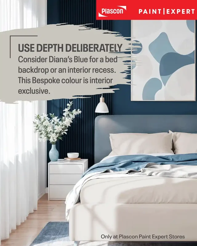
Diana’s Blue supplies the capsule’s strongest contrast. Its deep, subdued blue works as a focal point behind a bed, around an interior reading nook or on a carefully chosen architectural feature.
Best practice: Diana’s Blue is marked “interior exclusive” on the supplied Bespoke swatch. Keep this colour indoors and ask your store to confirm a suitable coating for the intended surface.
Dusky Mood: a softer blue with presence
Dusky Mood brings a muted, greyed blue into the scheme. It occupies the middle ground between pale Ocean Crystal and deep Diana’s Blue, making it a useful option when you want blue walls with more visual substance.
Try it in a bedroom with off-white bedding and a simple timber headboard. Let the bedding, curtains and floor balance the colour rather than introducing several competing patterns.
Ocean Crystal: a pale coastal backdrop
Ocean Crystal is the palest blue in this capsule. t has a softly greyed, watery appearance that suggests the shallows rather than a bright tropical sea.
Consider it for a bedroom, breakfast corner or bathroom colour scheme. Pair it with Feather Dust and natural textures to retain warmth within the lighter composition.
How to balance coastal paint colours
Choose one dominant colour, a supporting shade and a smaller accent. A clear hierarchy gives the room a focal point and prevents four attractive colours from competing for attention.
For a neutral-led lounge, use Feather Dust on most walls, Ocean Crystal in an adjoining area, and textiles that echo Dusky Mood. Reserve Diana’s Blue for one intentional interior feature.
Expert insight: Treat the capsule as a set of related choices, rather than a requirement to paint every room in all four shades. Repeating two or three colours thoughtfully can connect adjoining spaces while allowing each room its own character.
Avoid rigid percentage rules. A large rug, existing floor or substantial sofa already contributes to the room’s colour balance, even though none of it comes from a paint tin.
Natural materials bring the palette to life
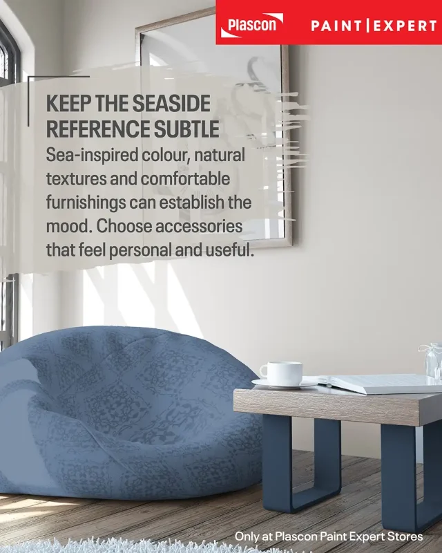
Timber, linen, cotton, woven fibres and ceramic pieces are useful companions to this capsule. Their varied textures give a restrained blue-and-neutral scheme more interest without requiring extra colours.
A timber coffee table introduces warmth beside Ocean Crystal. Linen curtains soften the composition around Diana’s Blue, while a woven basket adds a different surface against Feather Dust.
If your home already contains antiques, keep them in the conversation. An oak chest or inherited dining table can give the lighter coastal colours a grounded, personal setting.
Judge materials by their intended use as well as their appearance. Ask about cleaning and care before choosing a pale fabric or natural-fibre rug for a busy household.

Minimal living and relaxed luxury
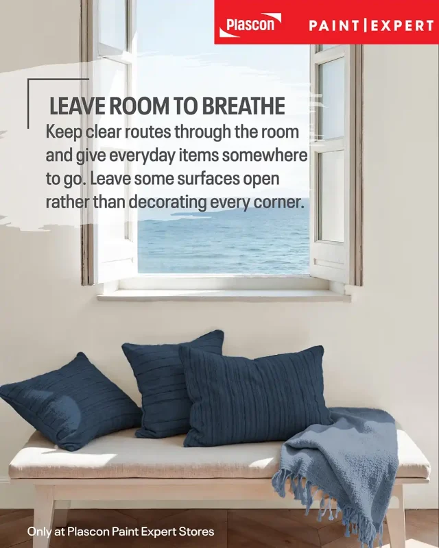
A restful coastal room benefits from fewer competing objects and furniture that supports daily life. Relaxed luxury comes through comfort, proportion and thoughtful choices.
Start with how the room is used. Leave a clear route through the lounge, place a reading light beside the chair where you actually sit, and give everyday items somewhere convenient to go.
Comfort should guide spending. A supportive sofa and curtains that suit your privacy needs will contribute more to the room than several decorative purchases made only to complete a theme.
Test the palette in your South African home
Assess these coastal colours in the room where they will be used. Lighting, surrounding finishes and paint sheen can affect how a colour appears.
A lounge opening onto a bright patio presents a different setting from a shaded bedroom. Test alongside your actual tiles, curtains and furniture, rather than assessing the swatch in isolation.
Plascon recommends trying a colour on different walls before committing. Look at your samples during the day and under the lights you use in the evening. Plascon South Africa
The Paint Club Colour Visualiser lets you upload a photograph and explore colour combinations digitally. Use that preview to consider placement and balance, then confirm with a physical sample because screen settings and image lighting affect the representation.
Separate colour choice from paint performance
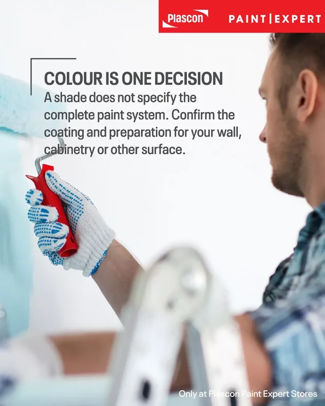
A colour name identifies the shade, rather than specifying a complete paint system. Ask an authorised Plascon Paint Expert store to recommend the coating, preparation and finish for your particular surface.
For a bathroom or kitchen, explain the room’s ventilation, cleaning needs and any existing moisture problems. Paint Expert’s damp guidance stresses identifying and addressing the source of damp rather than relying on a decorative coating to solve it.
How to Prevent Damp and Water Damage
Practical tips for a restful coastal room
Begin with the room’s existing finishes and build the palette around them.
Tip: Start with what stays.
Place the colour samples beside your floor, sofa and cabinetry. These larger elements need to work with the new wall colour.
Tip: Make one clear focal point.
Consider Diana’s Blue behind a bed or within an interior recess. Let the other surfaces support that choice.
Tip: Test the warm and cool shades together.
View Feather Dust beside Ocean Crystal and Dusky Mood. Assess the whole combination in your room.
Tip: Repeat texture before adding pattern.
Introduce interest through timber grain, woven surfaces and fabric texture. Add pattern where the room needs it.
Tip: Ask about a representative sample.
Your store can advise on available sampling options and suitable coatings. Confirm the shade and finish before purchasing the full quantity.
Common coastal decorating mistakes
Coastal schemes can feel disjointed when colour, texture and practical use are considered separately. A simple room plan helps prevent unnecessary purchases and awkward combinations.
Using every colour equally. Four similar-sized painted areas can compete. Choose a dominant shade and give the others supporting roles.
Choosing from a screen alone. Digital colour is a representation, so the finished room may differ from the preview. Confirm your choice physically before painting.
Buying décor before assessing the room. A collection of coastal accessories may still clash with existing floors or furniture. Resolve the main colours and materials first.
Taking Diana’s Blue outdoors. Diana’s Blue is exclusively for interior use. Ask your store about an appropriate exterior alternative if needed.
Painting over unresolved damp. A colour refresh cannot address the underlying moisture source. Arrange suitable assessment and preparation before decorating.
Key takeaways
This coastal capsule brings together warm neutrality, pale watery colour and deeper ocean blues. The most effective scheme gives those shades clear roles and supports them with comfortable furnishings and natural textures.
- Feather Dust provides the warm neutral foundation.
- Ocean Crystal offers the palest blue backdrop.
- Dusky Mood introduces a more substantial, muted blue.
- Diana’s Blue provides depth and is interior exclusive.
- Physical samples help you assess the palette in your own lighting.
- This curated capsule is exclusively available from authorised Plascon Paint Expert stores nationwide.
Frequently asked questions
This capsule can be adapted to different rooms through colour placement and furnishings.
What paint colours create a coastal look?
Warm neutrals, pale watery blues and deeper ocean accents can form a coastal scheme. This capsule combines Feather Dust, Ocean Crystal, Dusky Mood and Diana’s Blue.
Can I use coastal colours in an inland home?
Yes. Use the palette to recall seaside holidays through colour, texture and comfortable furnishings, regardless of your home’s location.
Which colour should I use on most walls?
Feather Dust is a useful neutral-led starting point. Ocean Crystal or Dusky Mood can take the lead if you prefer a bluer room.
Do I need all four colours in one room?
No. Choose the shades that suit the room and repeat selected colours across adjoining spaces if you want continuity.
Is Diana’s Blue suitable for exterior walls?
No. Diana’s Blue is exclusively for interior walls.
What furniture works with this coastal palette?
Consider timber furniture, comfortable pale upholstery and a few woven or ceramic pieces. Test the paint colours against furniture you plan to keep.
Can these colours be used in a bathroom scheme?
They can inform the colour scheme, but coating suitability must be confirmed separately. Ask your store about the surface, moisture exposure and preparation requirements.
Where can I find this coastal colour capsule?
The curated capsule is exclusively available from authorised Plascon Paint Expert stores nationwide. Use the store finder to locate your nearest store.
Bring a little of the coast into everyday life
Start with the colours and comforts that remind you of an easy day by the sea. A warm wall, a soft blue bedroom and a favourite chair can give that holiday feeling a place in your daily routine.
Disclaimer
Colour descriptions and styling suggestions are interpretive. Digital swatches may differ from actual paint; confirm colours with physical samples. Follow the chosen product’s technical instructions and obtain advice for the surface and environment.