|
Getting your Trinity Audio player ready...
|
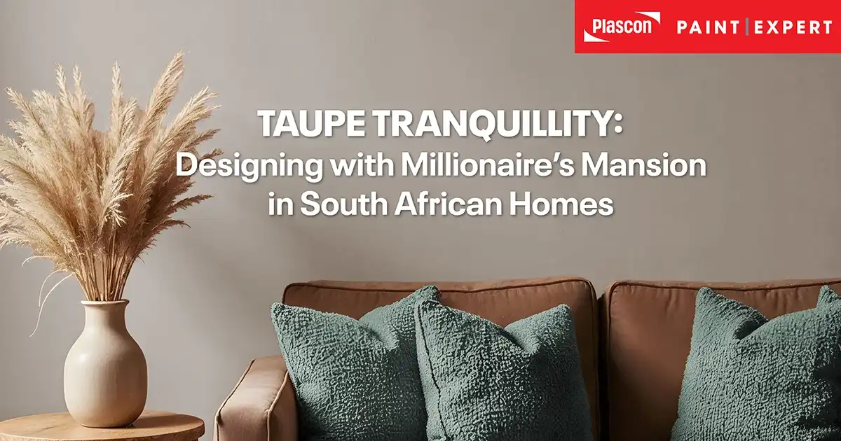
There is a reason taupe keeps resurfacing in serious interior design conversations. It’s quiet without being bland. Warm without feeling heavy. Contemporary without chasing trends.
For homeowners, decorators, and design-led contractors across South Africa, the shift away from stark greys and cool minimalism has been unmistakable. Clients want warmth again – but they don’t want to go back to yellow-beige walls of the early 2000s. That sweet spot? Taupe.
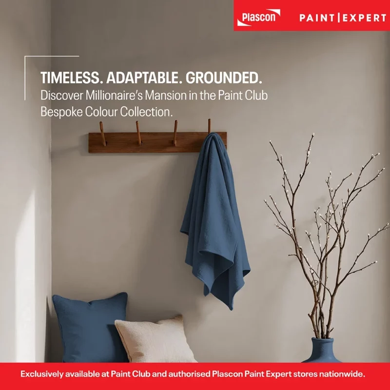
Within the Paint Club Bespoke Colour Collection, Millionaire’s Mansion sits confidently in that space. Part of our Neutrals Collection, it offers something rare: a neutral that feels grounded yet refined.
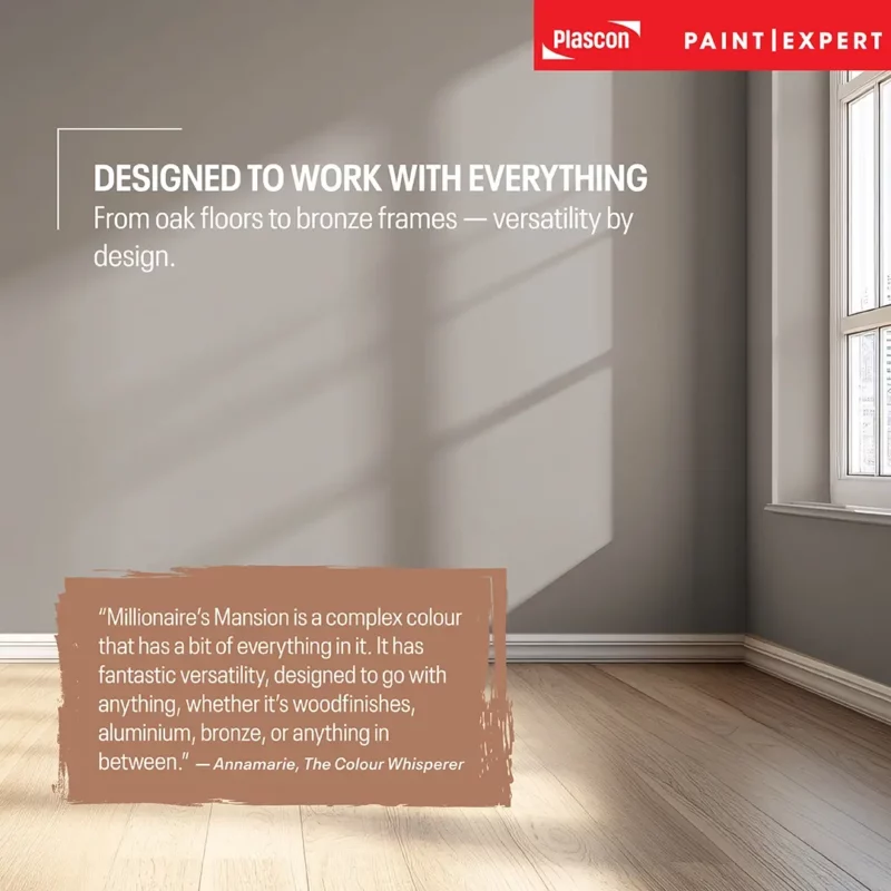
As Annamarie, our Paint Club colour developer – widely known as The Colour Whisperer – explains:
“Millionaire’s Mansion is a complex colour that has a bit of everything in it. It has fantastic versatility, designed to go with anything, whether it’s wood finishes, aluminium, bronze, or anything in between.”
This is not accidental. It’s formulation by design.
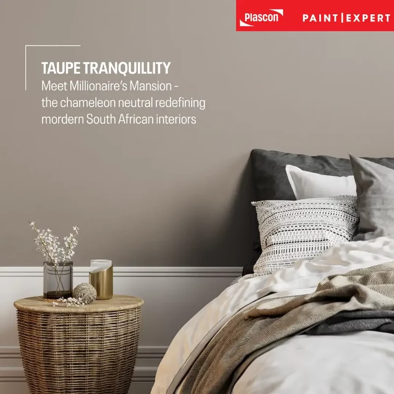
Understanding Taupe: Why This Colour Family Endures
What Exactly Is Taupe?
Taupe sits between grey and brown. It isn’t fully warm. It isn’t fully cool. It often carries subtle mushroom or violet undertones depending on the formulation.
Unlike flat beige, taupe has depth. Unlike flat grey, taupe has warmth.
Millionaire’s Mansion lands in the light-to-medium taupe category: enough warmth to prevent sterility, enough grey to remain current.
Why Taupe Is Replacing Cool Grey in South Africa
Over the past decade, cool greys dominated new builds. Yet many of those interiors now feel clinical, particularly in:
- Highveld winter light
- Overcast Cape Town days
- Shaded Durban properties
Taupe reintroduces warmth without compromising neutrality. It connects interiors to South Africa’s natural palette – sandstone, earth, timber, bushveld tones.
From a national retail perspective across our 80+ independent member stores, we’ve seen a measurable swing toward warmer neutrals over the last few seasons.
This isn’t a fleeting trend. It’s a correction.
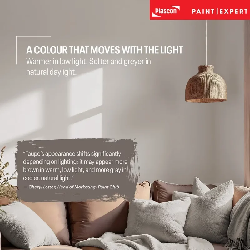
The Chameleon Effect: How Millionaire’s Mansion Responds to Light
Taupe is highly responsive to lighting conditions – and this is where experience matters.
In practice:
- Warm artificial lighting (2700K–3000K) brings out the brown undertones.
- Cool natural daylight reveals more of its grey side.
- Late afternoon light deepens it subtly without turning muddy.
This responsiveness is precisely why the colour performs so well across provinces.
As Cheryl Lotter, Head of Marketing at Paint Club, notes from real-world applications:
“Taupe’s appearance shifts significantly depending on lighting; it may appear more brown in warm, low light, and more grey in cooler, natural light.”
In Johannesburg north-facing rooms, Millionaire’s Mansion often reads slightly greyer during peak daylight. In Durban’s coastal warmth, it leans mushroom and earthy.
That adaptability is not a flaw, it’s a strength.
View our full Paint Club Bespoke Colour Collection here.
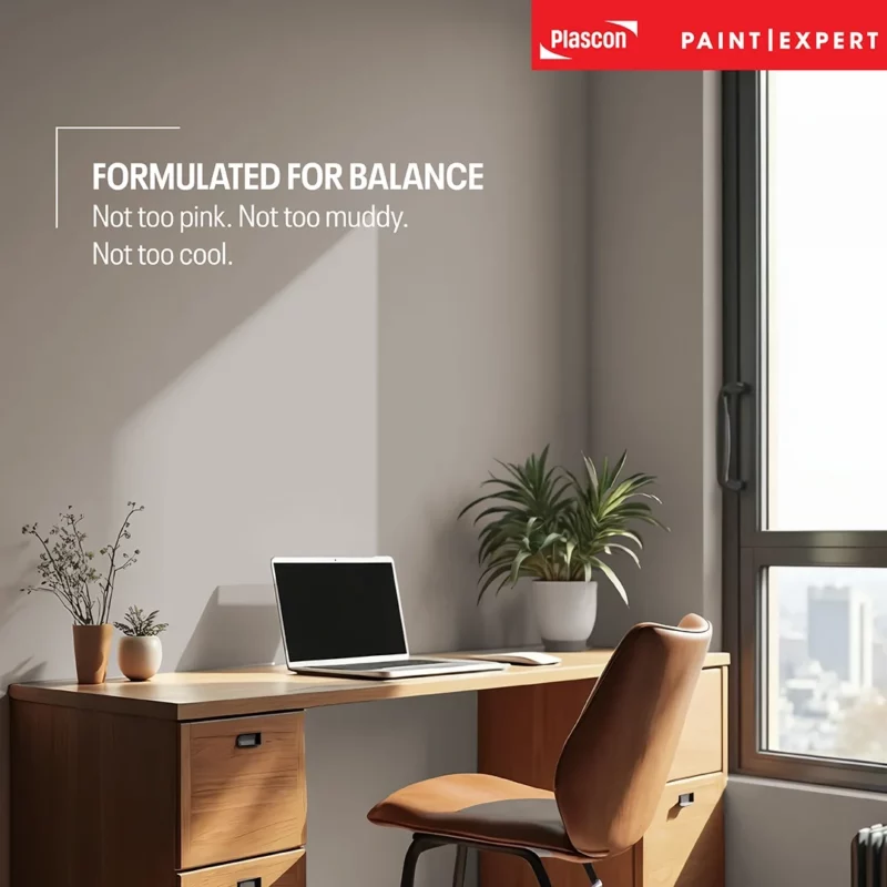
Designing with Millionaire’s Mansion
A Foundation Neutral That Doesn’t Feel Flat
Millionaire’s Mansion is not a “safe beige.” It has personality without being demanding.
Cheryl describes it this way:
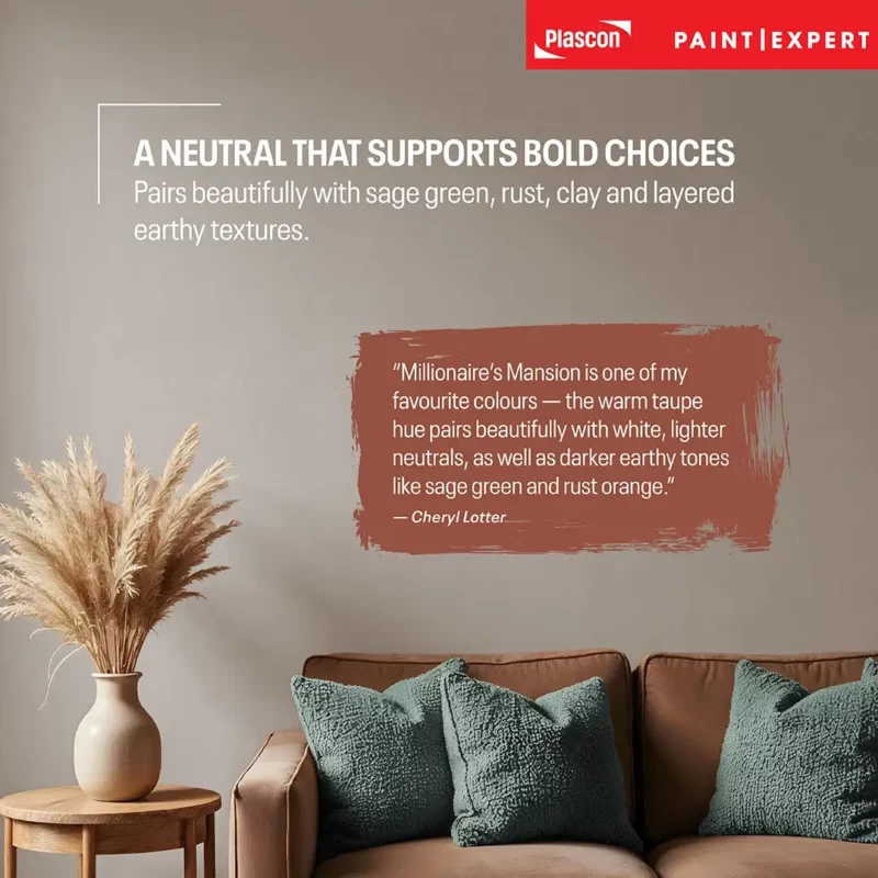
“Millionaire’s Mansion is one of my favourite colours – the warm taupe hue pairs beautifully with white, lighter neutrals, as well as darker earthy tones like sage green and rust orange.”
That pairing flexibility is what gives it longevity.
Pairing It with White
The wrong white can derail taupe.
Avoid blue-based whites. Instead, choose a white with subtle warmth to maintain cohesion.
In estate homes across Gauteng and KZN, this combination delivers a refined, contemporary look without feeling sterile.
With Wood Finishes
This is where Millionaire’s Mansion excels.
It bridges:
- Oak flooring
- Walnut cabinetry
- Kiaat feature elements
- Bronze and black aluminium window frames
Because it contains both warmth and neutrality, it connects rather than competes.
With Earthy Accents
Millionaire’s Mansion makes an exceptional base layer for:
- Sage green feature walls
- Rust or burnt orange décor
- Clay or terracotta accents
- Soft charcoal trims
Cheryl adds:
“It is a real ‘chameleon colour’ that can work in any space, from lounges and bedrooms to bathrooms and kitchens.”
That universality is rare. Many neutrals collapse under bold accents. This one supports them.
Room-by-Room Application
Lounges
Creates understated sophistication. Ideal for open-plan homes needing continuity across living and dining spaces.
Use in a durable interior finish suited to high-traffic areas.
Easy Living Sheen
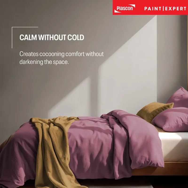
Bedrooms
Taupe creates cocooning calm without darkening the room. Particularly effective in homes where bedrooms receive softer morning light.
Layer with textured linens and timber elements for dimension.
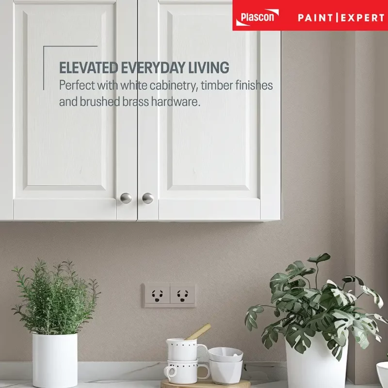
Kitchens
Pairs beautifully with:
- White cabinetry
- Timber cabinetry
- Brushed brass hardware
- Matte black fixtures
Avoid overly cool blue-grey countertops unless contrast is intentional.
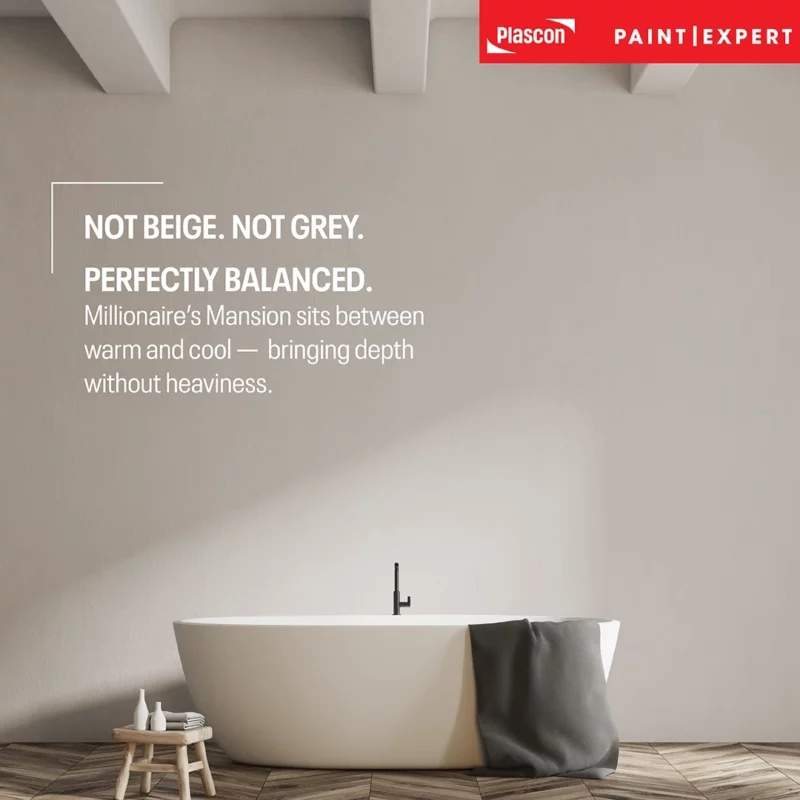
Bathrooms
In bathrooms, taupe softens hard finishes.
It complements:
- Stone-look porcelain
- Natural tiles
- Timber vanities
Always use moisture-resistant interior paint in high-humidity environments.
Kitchens & Bathrooms Paint
Exterior Use: Thoughtful Application
Taupe is highly effective on exterior plaster in South Africa’s intense sunlight.
It reduces glare compared to white and avoids the heat-absorbing heaviness of darker greys.
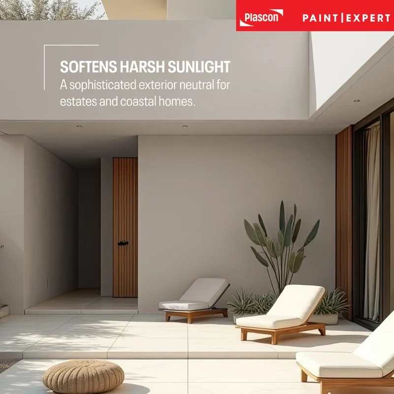
Particularly effective for:
- Modern farmhouse builds
- Estate developments
- Coastal homes
When paired with textured finishes such as Micatex:
Micatex
Always consider estate guidelines and surrounding landscape tones.
Common Mistakes When Using Taupe
- Testing Too Small
Large test panels are essential. A 10cm swatch is meaningless in changing light. Remember to test on multiple walls in your space, so you can see the full effect of varying light. - Pairing with the Wrong White
Blue-based whites flatten taupe. - Ignoring Fixed Elements
Always compare against:• Flooring
• Tiles
• Cabinetry
• Roof colour (for exterior)
Why Millionaire’s Mansion Is a Strategic Neutral
Across our independent store network, colours that succeed long-term are not dramatic, they are adaptable.
Millionaire’s Mansion sits in that rare category.
It supports:
- Warm contemporary interiors
- Earth-led palettes
- Wabi-sabi influences
- Timeless layered design
It isn’t trend-chasing. It’s design-forward without being risky.
That’s the sweet spot South African homeowners are looking for.
The Quiet Authority of Taupe
Millionaire’s Mansion offers something increasingly rare: neutrality with character.
It adapts to lighting. It bridges materials. It supports bold accents without competing. It works in lounges, bedrooms, kitchens, and bathrooms, and even exteriors when applied thoughtfully.
If you’re designing for calm, cohesion, and long-term appeal, Millionaire’s Mansion deserves serious consideration.
And when colour feels complex, expert guidance matters – that’s where your local Paint Club store makes the difference.
Find the Plascon Paint Expert store nearest you: FIND A STORE
FAQs
- Is Millionaire’s Mansion a warm or cool taupe?
It is a balanced warm taupe with subtle grey undertones. - Does taupe make rooms look smaller?
Not when paired correctly with lighter trims and good lighting. - What white works best with Millionaire’s Mansion?
A warm-based white. - Can I use this colour throughout an entire house?
Yes – especially in open-plan layouts. - Does taupe look dated?
Modern balanced taupes do not. Undertone balance is key. - Is it suitable for coastal homes?
Yes, when paired with appropriate exterior products. - What flooring pairs best?
Light oak, mid-tone timber, stone-look porcelain, polished concrete. - Will it clash with black window frames?
No. It pairs beautifully. - How should I test it?
Use large sample boards and observe at different times of day. - Where can I get Millionaire’s Mansion tinted?
Millionaire’s Mansion is exclusively available at Paint Club and authorised Plascon Paint Expert stores nationwide, as it is part of the Paint Club Bespoke Colour Collection.
Disclaimer
Colour perception varies depending on lighting, surrounding finishes, texture, and application. Always test before committing. Consult your nearest Paint Club store for professional guidance.
