|
Getting your Trinity Audio player ready...
|
Some homes never quite feel warm – no matter how many throws are added or how carefully the furniture is arranged. In South Africa, this is especially true of homes with south-facing rooms, shaded suburban plots, compact layouts, or older properties where winter light barely reaches beyond the windows. These spaces don’t need louder colour. They need better colour.
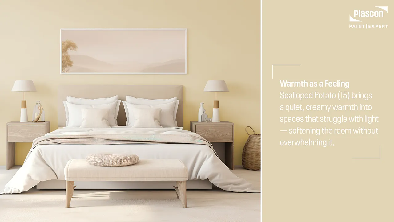
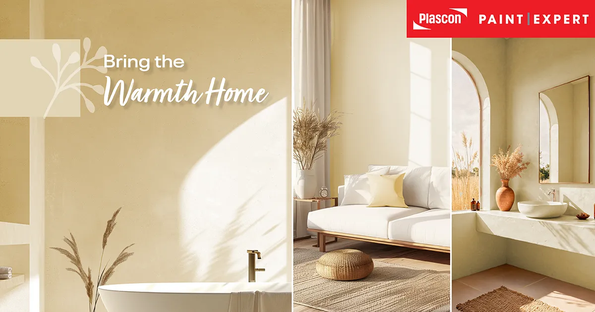
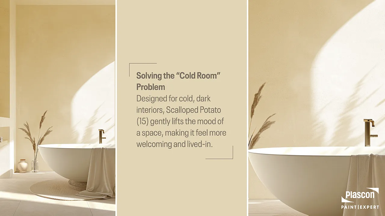
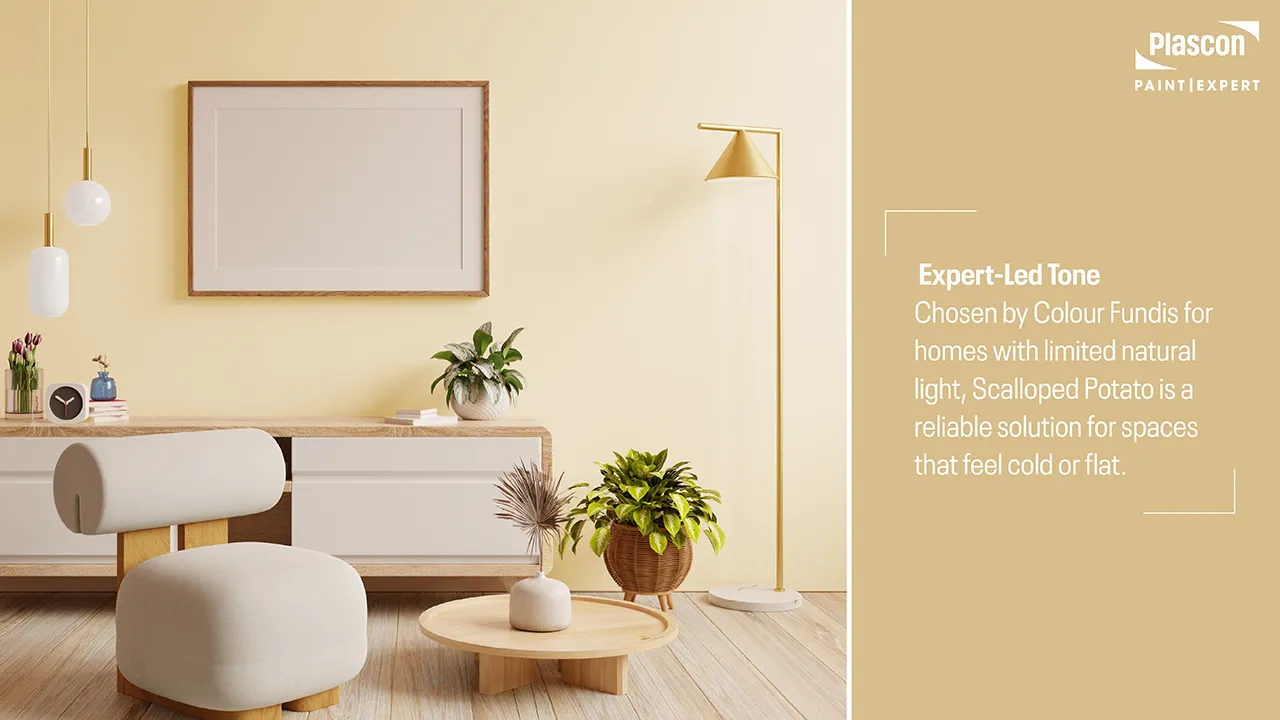
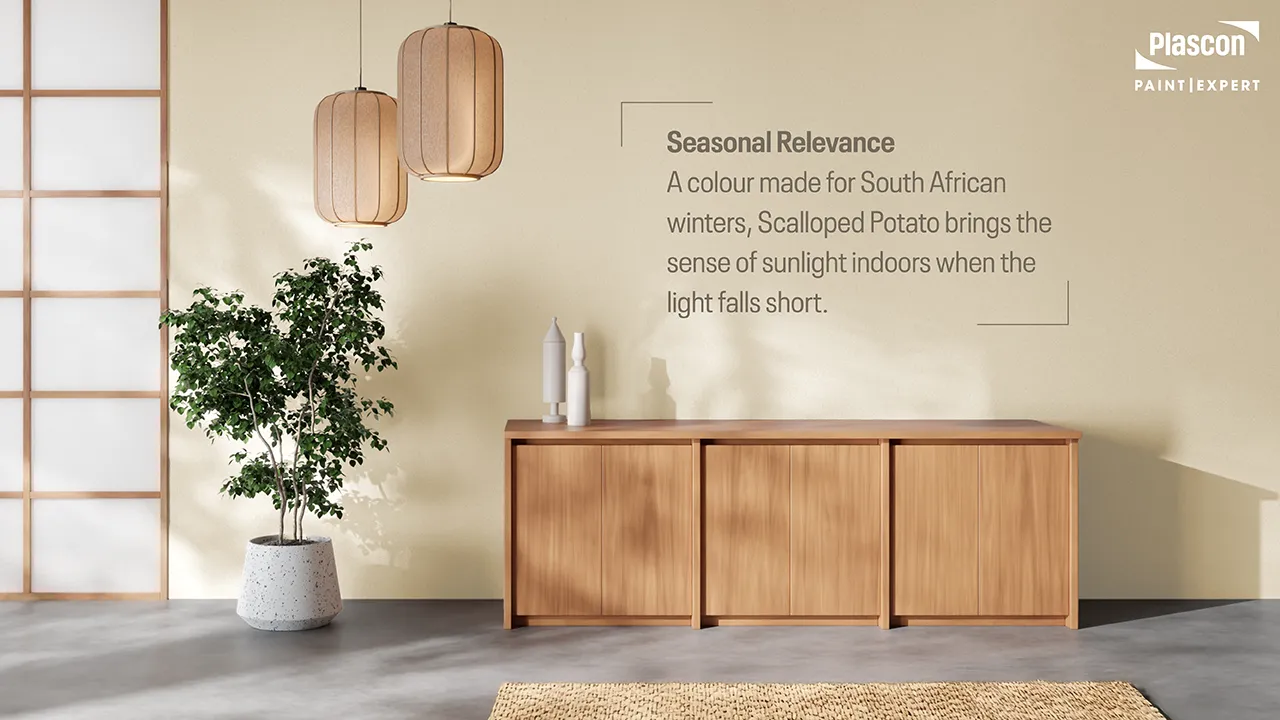
Scalloped Potato (15), from Plascon’s Essential Colour Collection, answers this challenge with subtle authority. A warm, creamy beige inspired by comfort and familiarity, it has the rare ability to soften light, lift mood, and bring a sense of gentle sunshine into spaces that feel perpetually cool or flat.
Within the Plascon Paint Expert ecosystem, this colour has emerged as a quiet favourite among Colour Fundis – not because it shouts for attention, but because it consistently solves a real problem South African homeowners face: how to warm a home without overpowering it.
This article explores why Scalloped Potato works, where it works best, and how to use it expertly – drawing on real-world experience, South African context, and Colour Fundi insight from Cheryl Lotter, with over 20 years in the paint and coatings industry.
Understanding the South African “Cold Home” Problem
It’s Not Just About Temperature
A “cold” home is rarely cold in degrees alone. It’s usually the result of a combination of:
- South- or east-facing rooms with limited direct sunlight
- Deep eaves, verandas, or neighbouring buildings casting shade
- Overcast winter skies common in parts of Gauteng, KZN Midlands, and the Western Cape
- Dark flooring, heavy cabinetry, or cool-toned previous paint choices
- Compact rooms where light struggles to bounce
In these environments, cool whites and grey-based neutrals – once popular – often exacerbate the problem. Instead of feeling clean, they feel flat, greyed-out, or even slightly blue.
“One of the biggest mistakes I see is homeowners choosing ‘safe’ cool neutrals for already dark rooms,” says Cheryl Lotter, Colour Fundi.
“They think they’re keeping things neutral, but they’re actually draining warmth and life from the space.”
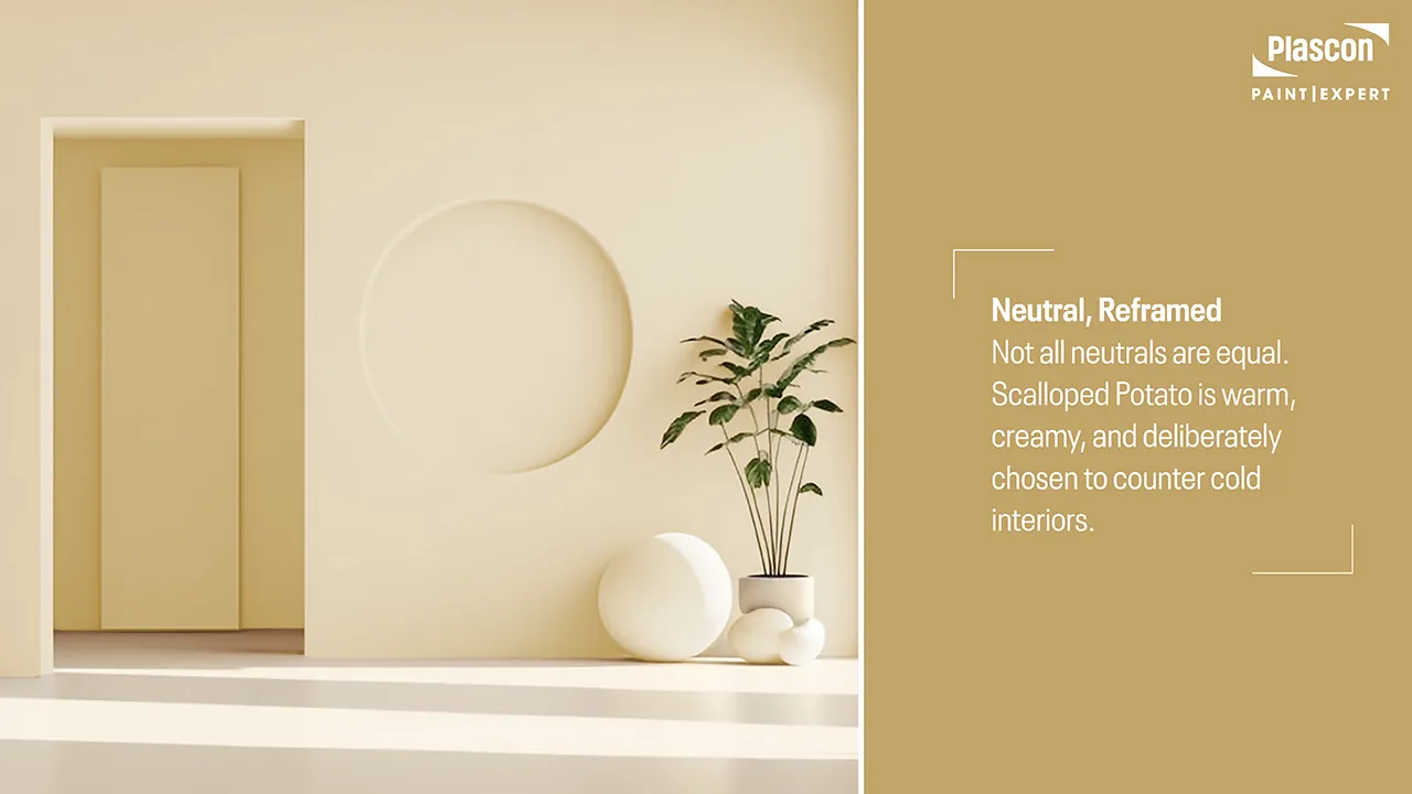
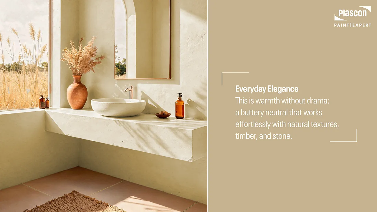
What Makes Scalloped Potato (15) Different?
A Warm Neutral with Purpose
Scalloped Potato sits firmly in the warm neutral family – but unlike deeper beiges or yellows, it remains light, breathable, and contemporary. Its warmth is creamy rather than golden, which allows it to reflect available light instead of absorbing it.
Key characteristics include:
- A soft warmth that counteracts grey winter light
- Enough depth to avoid looking stark or chalky
- A creamy undertone that flatters natural wood, stone, and warm metals
- Exceptional versatility across open-plan and small spaces
“Scalloped Potato is what I call a ‘problem-solver colour’,” Cheryl explains.
“When a client says their home feels cold, uninviting, or dull, especially in winter, this is one of the first colours I consider.”
How Light Interacts with Scalloped Potato
Low Light, High Payoff
In low-light conditions, Scalloped Potato does something many neutrals can’t: it holds its warmth. Rather than shifting grey or muddy, it maintains a soft, buttery glow.
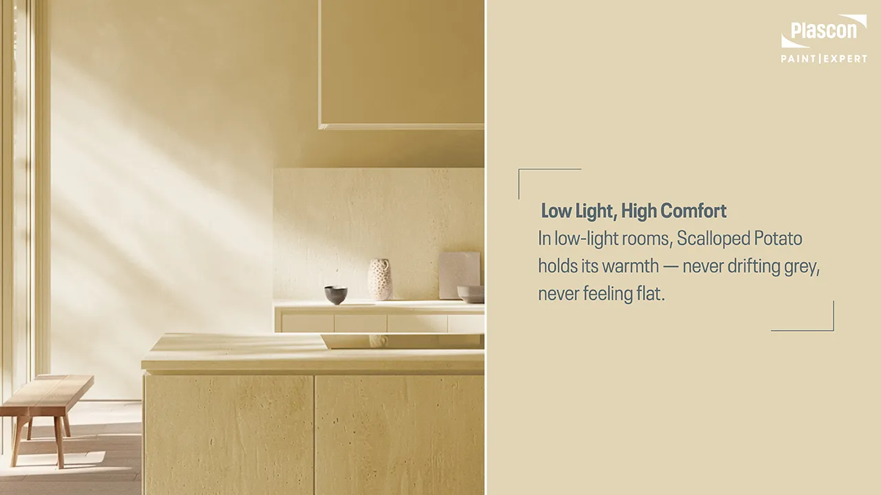
This makes it particularly effective in:
- South-facing lounges
- Bedrooms with limited window exposure
- Apartments and townhouses with close neighbours
- Hallways, stairwells, and transition spaces
Where Scalloped Potato Works Best in the Home
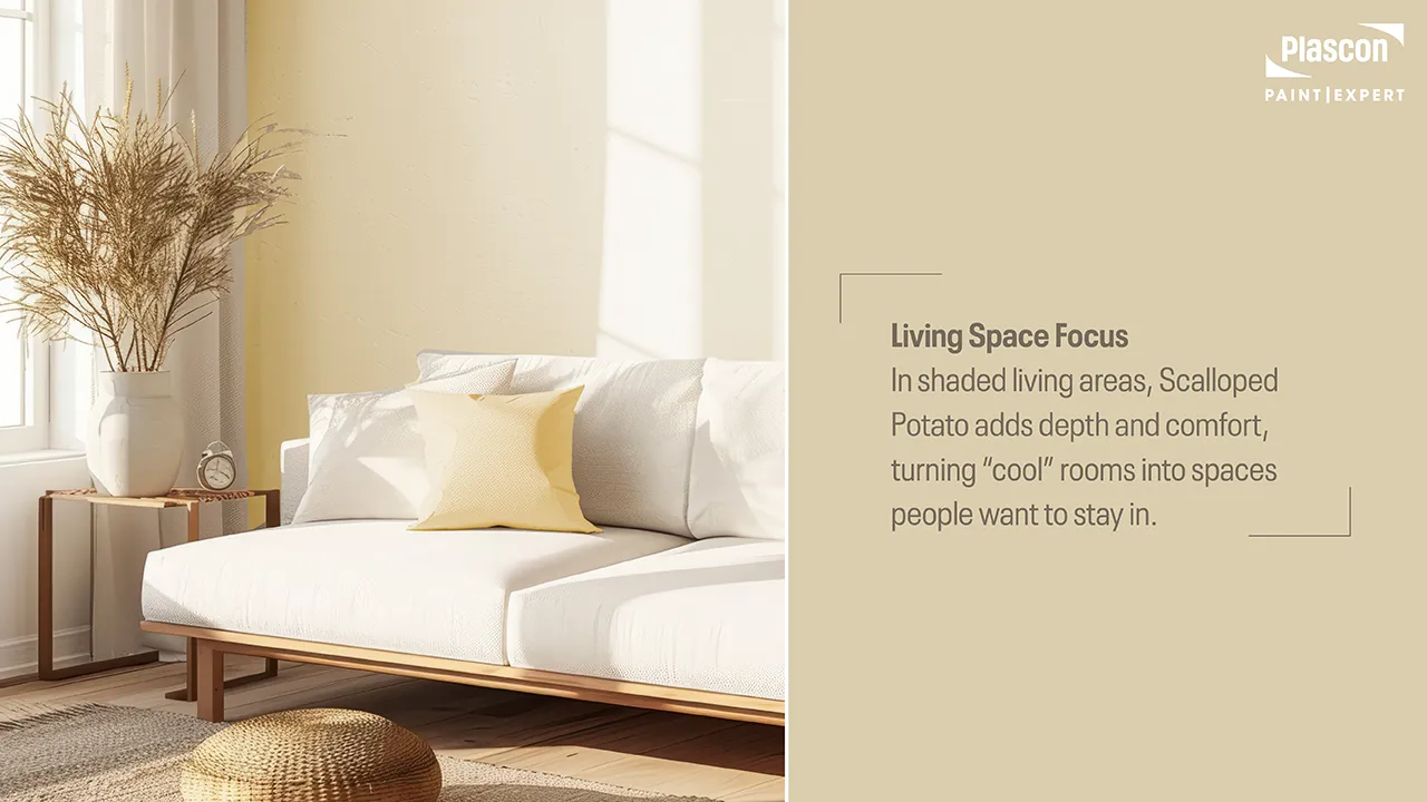
Living Rooms That Need Softening
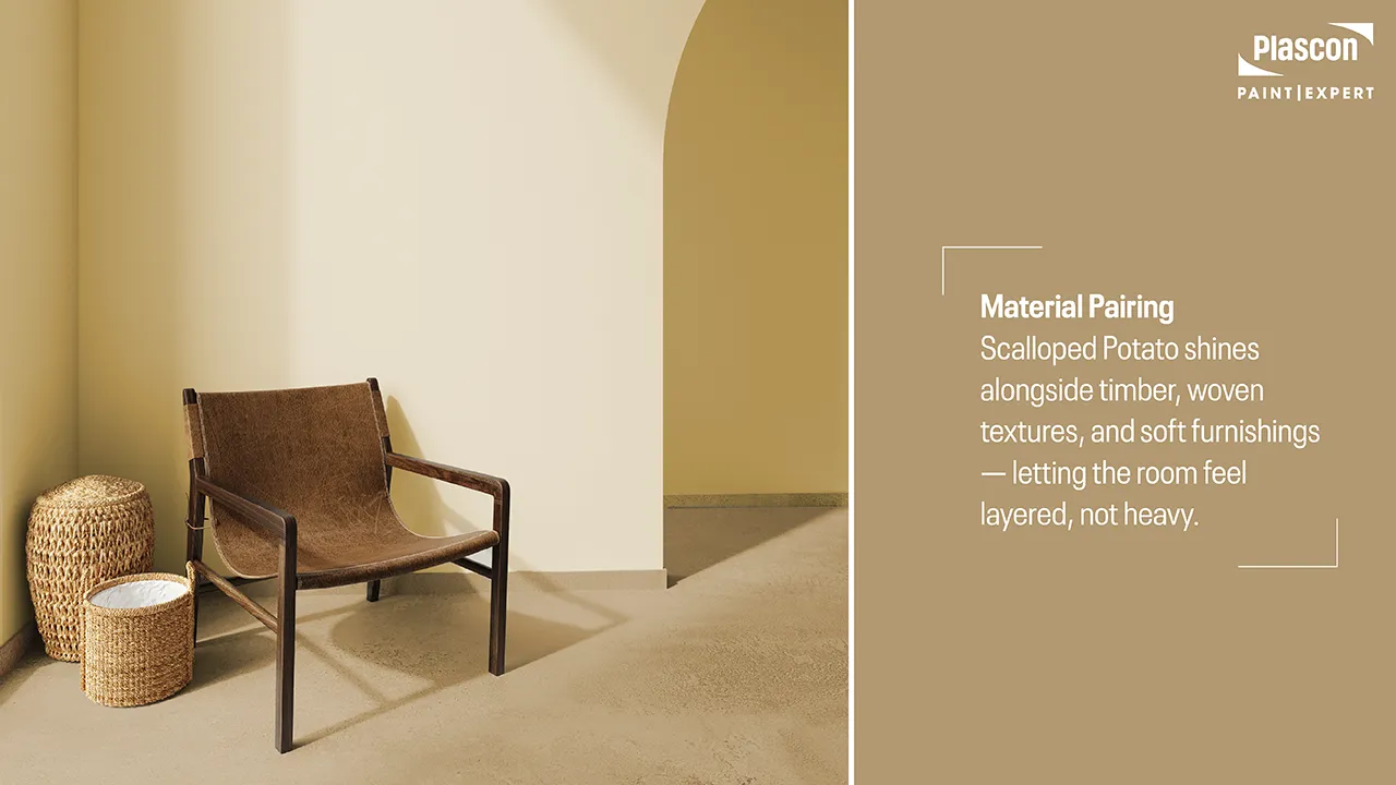
In shaded lounges, Scalloped Potato creates a welcoming backdrop that works beautifully with:
- Timber furniture
- Leather and linen upholstery
- Woven textures and natural rugs
It doesn’t compete with décor — it supports it.
Bedrooms That Feel Warmer Instantly
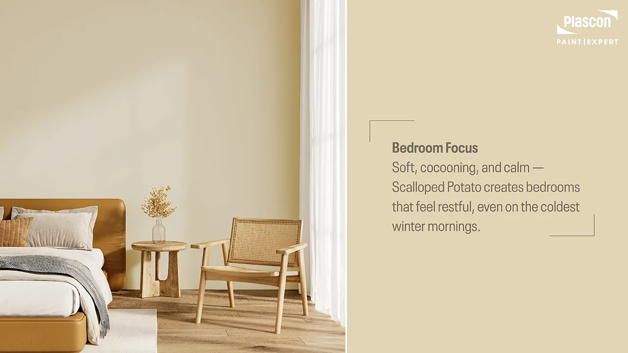
Bedrooms painted in Scalloped Potato feel cocooning without being heavy. The colour encourages rest and comfort, especially when paired with:
- Warm whites on ceilings and trims
- Layered bedding in oat, caramel, or soft clay tones
- Natural light filtered through sheer curtains
“In bedrooms, Scalloped Potato feels like wrapping the room in warmth,” says Cheryl. “It’s calming without being sleepy, and cosy without being dark.”
Kitchens and Dining Spaces
Despite its softness, Scalloped Potato performs beautifully in kitchens and dining areas – particularly when paired with:
- White or cream cabinetry
- Natural stone or quartz countertops
- Brass, bronze, or matte black fittings
For these spaces, durability matters.
Easy Living Sheen – High-Traffic Interiors
Exterior Applications (When Warmth Matters)
Scalloped Potato can also be used externally, particularly on:
- Shaded façades
- Courtyard walls
- Covered verandas
In these areas, it prevents the exterior from feeling cold or stark, especially in winter months.
Easy Living Plush Matt – Exterior Use
Pairing Scalloped Potato with Other Colours
Ceiling & Trim Choices
For best results:
- Choose a warm white for ceilings to maintain brightness
- Avoid stark cool whites, which can dull the warmth
- Keep trims subtle and tonal
Accent Colours That Elevate It
Scalloped Potato pairs effortlessly with:
- Muted greens and olives
- Soft terracottas and clays
- Charcoal used sparingly
- Natural timber and stone
This makes it ideal for homes leaning into earthy, relaxed interiors rather than high-contrast modernism.
Finish Matters: Why Product Choice Is Critical
A colour’s success is only as good as the product it’s applied in.
- Easy Living Plush Matt enhances Scalloped Potato’s softness, reducing glare and creating a velvety, welcoming finish ideal for living rooms and bedrooms.
- Easy Living Sheen adds durability for busy spaces without compromising warmth or depth.
“The wrong sheen can undo a colour completely,” Cheryl notes.
“Plush matt gives Scalloped Potato its full, comforting expression, while sheen lets it perform in real homes with real life happening.”
Common Mistakes to Avoid
- Pairing it with cool grey tiles or blue-based whites
- Over-lighting the space with harsh LED temperatures
- Using it without considering furniture and flooring undertones
- Testing only on a small patch instead of a proper sample area
Why Colour Expert Advice Makes the Difference
Every home is different. Light direction, surrounding colours, textures, and lifestyle all influence how a colour behaves.
“No colour exists in isolation,” says Cheryl.
“Our role as Colour Experts is to help homeowners choose colours that work with their home – not against it.”
A visit to your nearest Plascon Paint Expert store allows you to see Scalloped Potato in context, compare it under store lighting, and receive tailored advice based on your specific space.
Summary: Quiet Warmth That Transforms
Scalloped Potato (15) is about comfort, warmth, and liveability – especially in homes where light is limited and warmth is needed most.
When applied thoughtfully, and paired with the right product and finish, it has the power to transform cold, dark interiors into spaces that feel inviting, calm, and gently sunlit all year round.
FAQs
- Is Scalloped Potato suitable for dark rooms?
Yes. It’s specifically effective in low-light spaces where cooler neutrals fail. - Will it make my room feel yellow?
No. It is creamy and warm, not yellow or golden. - Does Scalloped Potato work in modern homes?
Yes — particularly when paired with clean lines and natural textures. - Can I use it throughout my home?
Absolutely. It works well as a cohesive whole-home colour. - What paint finish is best for living areas?
A plush matt finish enhances warmth and softness. - Is it suitable for rental properties?
Yes — it’s neutral, appealing, and widely liked. - How does it compare to cool beige tones?
It maintains warmth where cool beiges can feel grey. - Can it be used on exterior walls?
Yes, especially in shaded or covered exterior areas. - Does lighting type affect how it looks?
Yes. Warm LED lighting enhances its creamy undertones. - Should I test before painting?
Always. Lighting, space, and surrounding colours matter.
Disclaimer
Disclaimer: Colours shown and described may vary depending on lighting conditions, substrate, application method, and screen calibration. Always test with a physical sample or sample pot before final application. Consult your nearest Plascon Paint Expert for professional colour advice.
