|
Getting your Trinity Audio player ready...
|
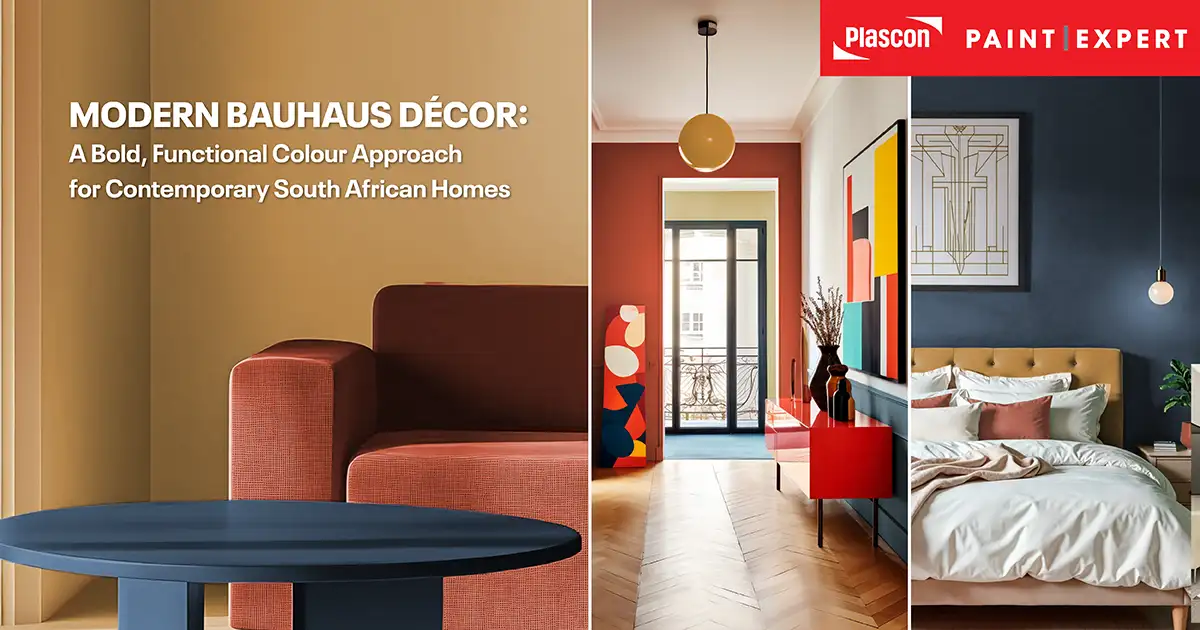
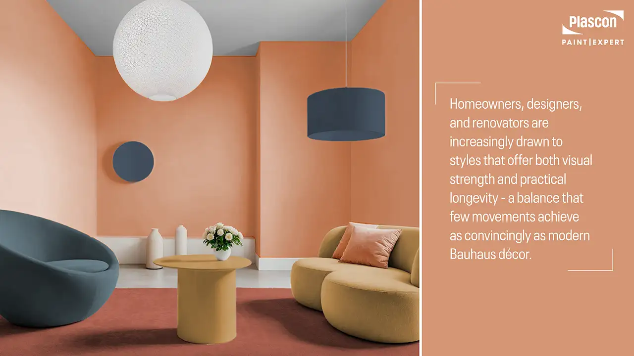
There is a growing shift in South African interiors away from purely decorative design and towards spaces that feel intentional, functional, and enduring. Homeowners, designers, and renovators are increasingly drawn to styles that offer both visual strength and practical longevity – a balance that few movements achieve as convincingly as modern Bauhaus décor.
Rooted in clarity, geometry, and purposeful design, Bauhaus interiors resonate strongly with today’s desire for calm, well-considered spaces that still make a confident statement. When interpreted through a contemporary lens – and adapted to South African light, architecture, and lifestyle – Bauhaus becomes less austere and far more livable.
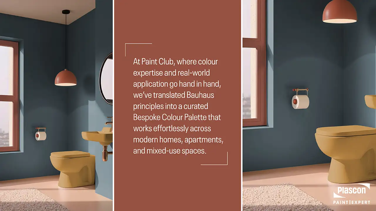
At Paint Club, where colour expertise and real-world application go hand in hand, we’ve translated Bauhaus principles into a curated Bespoke Colour Palette that works effortlessly across modern homes, apartments, and mixed-use spaces. This article unpacks how modern Bauhaus décor works today, why colour plays such a critical role, and how to use this palette with confidence in a South African context.
“What draws us to Bauhaus today isn’t nostalgia, it’s clarity,” says Cheryl Lotter, Head of Marketing at Paint Club and resident colour fundi. “South African homeowners are craving spaces that feel intentional and calm, without being stripped of warmth. Modern Bauhaus delivers exactly that balance when colour is used with discipline and confidence.”
Understanding Bauhaus: More Than a Design Trend
The Bauhaus Philosophy in Brief
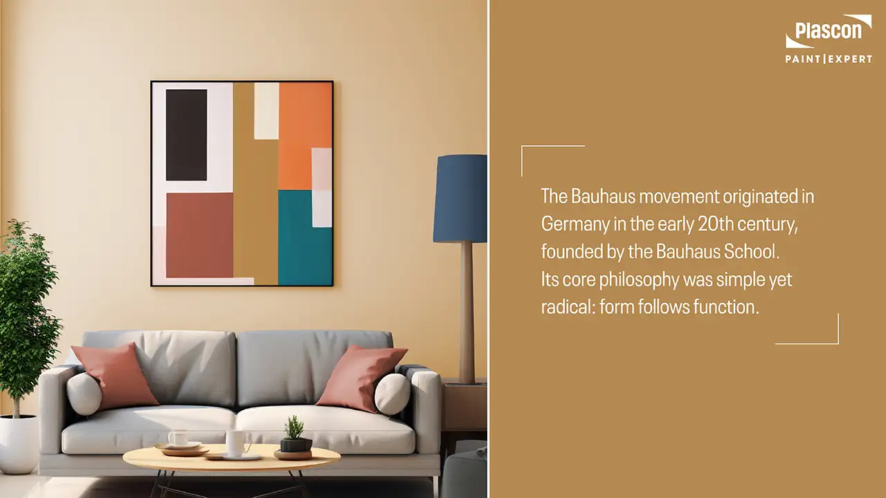
The Bauhaus movement originated in Germany in the early 20th century, founded by the Bauhaus School. Its core philosophy was simple yet radical: form follows function. Design was not meant to be ornamental for its own sake, but purposeful, honest, and accessible.
In interiors, this translated into:
- Clean architectural lines
- Geometric forms
- A restrained but confident use of colour
- Materials chosen for performance, not excess
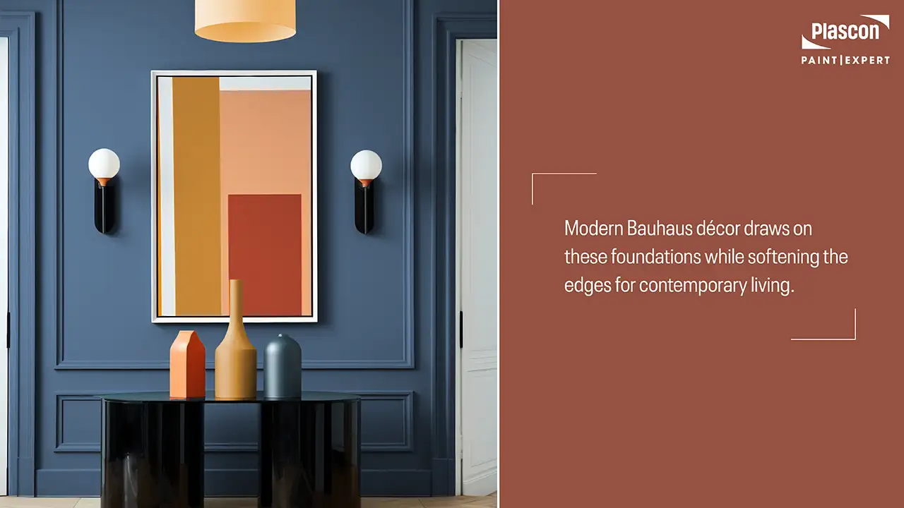
Modern Bauhaus décor draws on these foundations while softening the edges for contemporary living.
Why Bauhaus Works So Well Today
In an era of visual overload and fast décor trends, Bauhaus offers:
- Visual clarity in open-plan homes
- Longevity over trend-driven aesthetics
- Strong alignment with modern architecture
- A disciplined framework for confident colour use
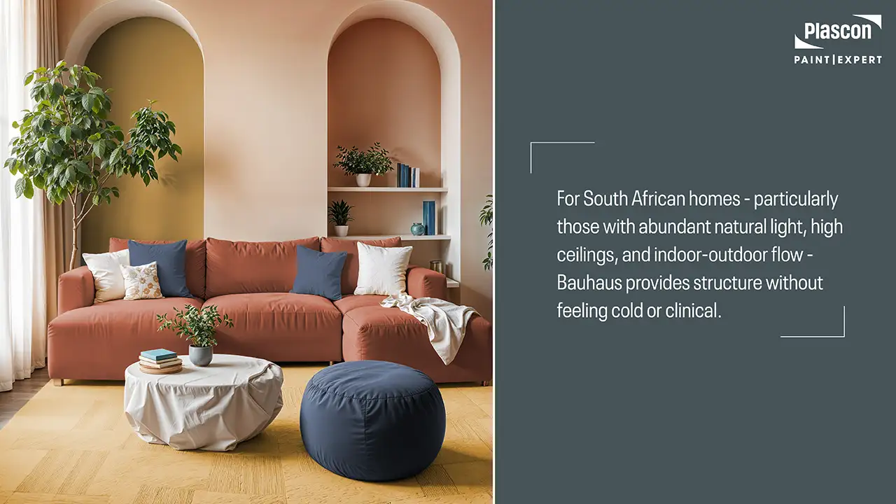
For South African homes – particularly those with abundant natural light, high ceilings, and indoor-outdoor flow – Bauhaus provides structure without feeling cold or clinical.
“We’re seeing a clear shift away from trend-chasing and towards design that lasts,” notes Lotter. “Bauhaus resonates because it gives people a framework: a way to make bold choices without overwhelming a space.”
Modern Bauhaus vs Original Bauhaus: What’s Changed?
Then: Minimal, Industrial, Restrained
Traditional Bauhaus interiors were often stark, with primary colours, steel furniture, and minimal softness.
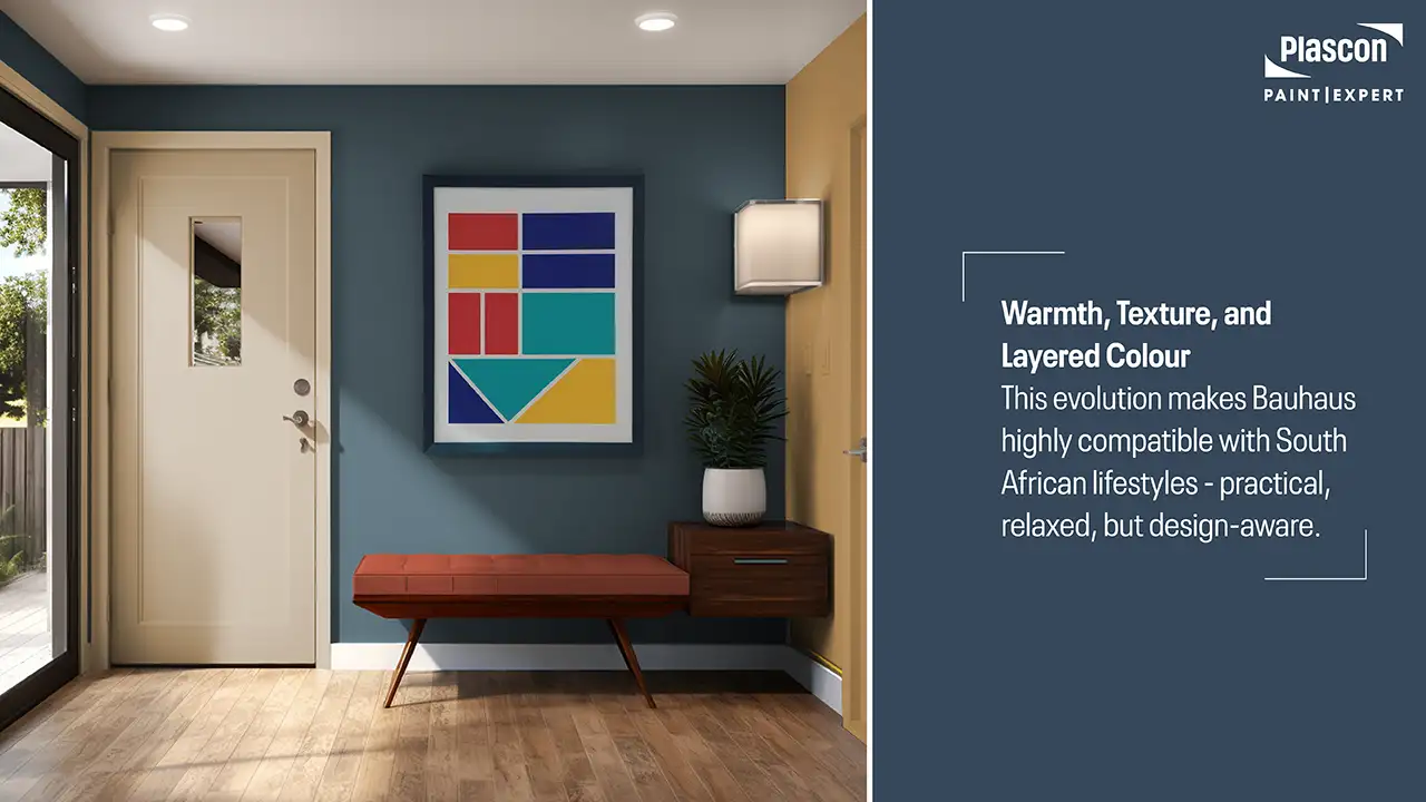
Now: Warmth, Texture, and Layered Colour
Modern Bauhaus décor introduces:
- Warmer, earth-influenced hues
- Matte finishes over gloss
- Textural balance through plaster, wood, and textiles
- Softer contrasts that suit residential spaces
This evolution makes Bauhaus highly compatible with South African lifestyles – practical, relaxed, but design-aware.
The Role of Colour in Modern Bauhaus Interiors
Colour as Structure, Not Decoration
“In Bauhaus-inspired interiors, colour isn’t just decorative, it’s architectural,” explains Lotter. “Each shade has a job to do. When colour starts competing instead of supporting form, the entire Bauhaus language breaks down.”
In Bauhaus-inspired interiors, colour is never random. It is used to:
- Define architectural zones
- Emphasise form and proportion
- Create visual rhythm
Rather than filling a space with multiple tones, Bauhaus interiors rely on fewer colours, used with intention and repetition.
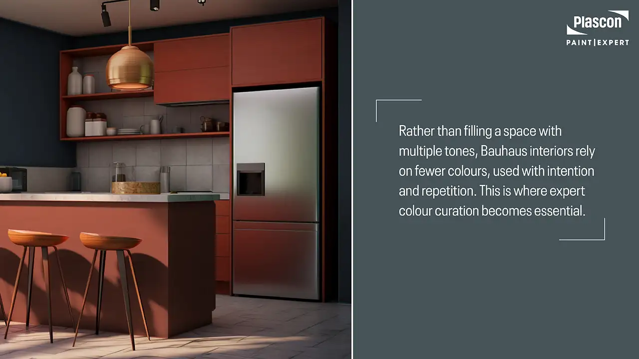
This is where expert colour curation becomes essential.
The Paint Club Bauhaus-Inspired Colour Capsule
“We didn’t set out to recreate a historic Bauhaus colour capsule,” says Lotter. “Our goal was to translate the principles of Bauhaus into colours that work in real South African homes – with our light, our architecture, and our lifestyle in mind.”
Why This Capsule Works
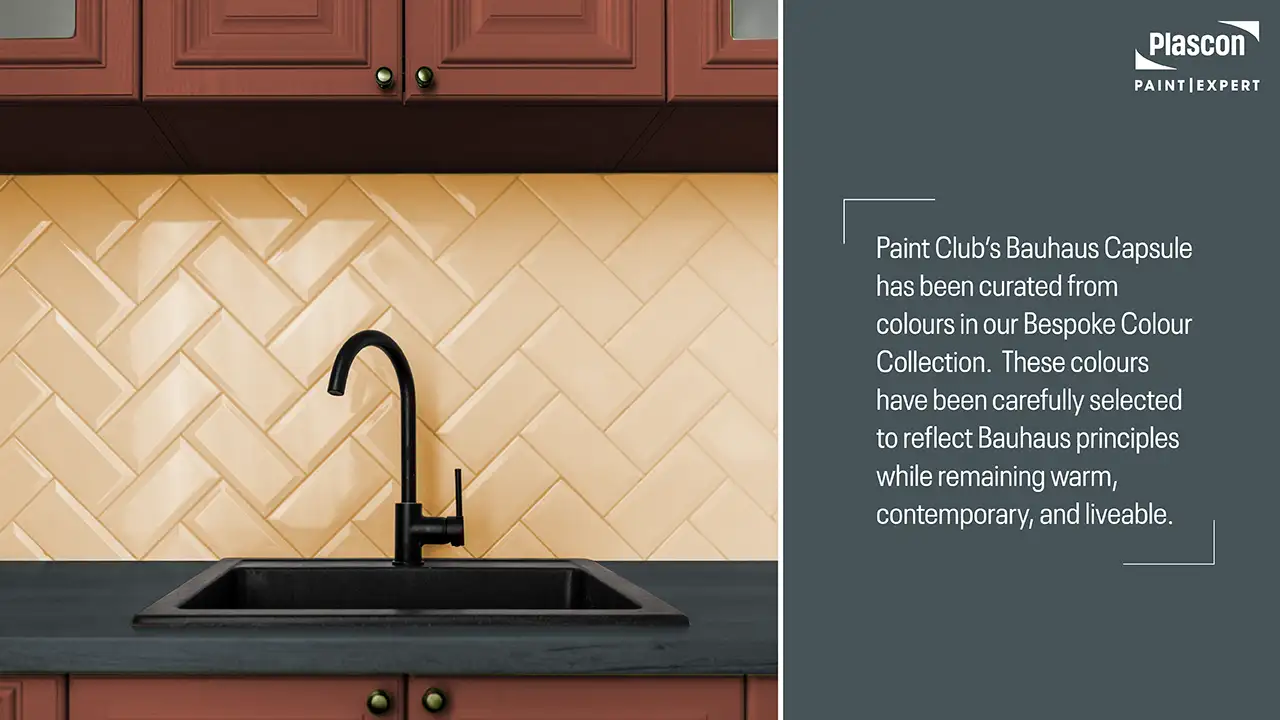
Paint Club’s Bauhaus Capsule has been curated from colours in our Bespoke Colour Collection. These colours have been carefully selected to reflect Bauhaus principles while remaining warm, contemporary, and liveable. These colours are grounded, confident, and exceptionally versatile across South African interiors.
Below is how each colour functions within a modern Bauhaus scheme.
Mocha Yellow
A warm, latte-inspired yellow with depth and softness.
How it’s used:
- Feature walls in living or dining spaces
- Softening large volumes of white or grey
- Bringing warmth to minimalist interiors
Mocha Yellow introduces optimism and warmth without tipping into brightness – ideal for north-facing South African rooms with strong daylight.
Soft Sun
A buttery, sun-washed hue that feels welcoming and calm.
How it’s used:
- Transitional spaces such as passages and stairwells
- Kitchens where warmth is desired without dominance
- As a balancing colour alongside darker Bauhaus tones
Soft Sun reflects natural light beautifully, making it particularly effective in compact or low-light interiors.
Vintage Clay
A peachy clay tone that introduces human warmth and tactility.
How it’s used:
- Bedrooms and reading areas
- Accent walls paired with natural textures
- Soft contrast against slate and blue-grey tones
Vintage Clay bridges the gap between Bauhaus geometry and the organic warmth South African homes often require.
Vincent
A deep mustard with gravitas and character.
How it’s used:
- Bold accent walls
- Joinery, alcoves, or architectural recesses
- Paired with neutrals for contrast-driven design
Vincent delivers the confidence Bauhaus is known for, without relying on primary colours.
Red Stone Hills
A brick-toned terracotta grounded in earth and architecture.
How it’s used:
- Dining rooms and entertainment spaces
- Feature zones in open-plan layouts
- Pairing with raw materials like concrete or timber
This colour resonates strongly with South Africa’s earthy landscape and modern brick architecture.
Astral Slate
A blue-grey inspired by natural slate stone.
How it’s used:
- Feature wall colour in living spaces
- Background tone for minimalist interiors
- Pairing with warm accents for balance
Astral Slate anchors Bauhaus interiors, providing calm structure and visual discipline.
Diana’s Blue
A deep, confident blue, slightly lighter than navy.
How it’s used:
- Statement walls in studies or lounges
- Bedrooms where depth and calm are desired
- Paired with warm yellows or terracotta tones
Diana’s Blue adds drama while maintaining sophistication – a hallmark of modern Bauhaus styling.
How to Build a Modern Bauhaus Colour Scheme
Use Fewer Colours, More Intentionally
A classic Bauhaus approach uses:
- One dominant base colour
- One secondary supporting colour
- One accent colour
This aligns closely with the 60–30–10 principle, which Paint Club frequently recommends for balanced interiors.
Let Architecture Lead
Use colour to:
- Highlight bulkheads and recesses
- Frame doorways or windows
- Define zones in open-plan homes
Avoid decorative colour blocking that doesn’t serve a spatial purpose.
South African Context: Climate, Light & Lifestyle
Natural Light Changes Everything
South African sunlight is strong and warm. Colours that feel flat in European interiors often come alive locally.
- Warm yellows and clays glow beautifully
- Blue-greys feel crisp rather than cold
- Deep blues remain rich without becoming heavy
Testing colour in real lighting conditions is essential.
Finish Matters: Paint Choice in Bauhaus Interiors
Modern Bauhaus interiors favour:
- Matt or low-sheen finishes
- Smooth, uniform wall surfaces
- High-quality paints that enhance colour depth
Premium wall paints with excellent levelling and colour accuracy are critical to achieving the clean lines Bauhaus demands.
Click here to explore our Premium Interior Paint Range
Common Mistakes to Avoid
- Overusing bold colours without restraint
- Mixing too many tones in one space
- Ignoring undertones and natural light
- Treating Bauhaus as cold or overly industrial
A successful Bauhaus interior feels considered, not severe.
Conclusion
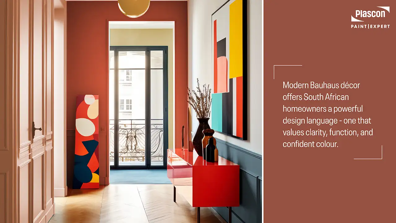
Modern Bauhaus décor offers South African homeowners a powerful design language – one that values clarity, function, and confident colour. When executed with warmth and expertise, it delivers interiors that feel timeless, architectural, and deeply liveable.
Paint Club’s Bauhaus-inspired Bespoke Colour Palette brings this philosophy to life through carefully selected hues that work with our light, climate, and lifestyle. With the right guidance, Bauhaus becomes not just a design trend, but a long-term approach to better living spaces.
“Modern Bauhaus is about respect,” concludes Lotter. “Respect for form, for colour, and for the way people actually live in their homes. When those elements align, the result is timeless.”
Frequently Asked Questions (FAQs)
What defines modern Bauhaus décor?
Modern Bauhaus décor focuses on functional design, clean lines, geometric forms, and intentional colour use, adapted for contemporary living.
Is Bauhaus suitable for family homes?
Yes. When softened with warm colours and textures, Bauhaus works exceptionally well in family-oriented spaces.
Can Bauhaus interiors feel warm?
Absolutely. Earth-influenced colours like clay, mustard, and terracotta introduce warmth without compromising structure.
How many colours should I use in a Bauhaus interior?
Typically three: a dominant base, a supporting tone, and a bold accent.
Are Bauhaus colours always bold?
No. Modern interpretations often rely on muted, sophisticated tones rather than primary colours.
Does Bauhaus work in small spaces?
Yes. Its disciplined approach can actually make smaller spaces feel more ordered and spacious.
What paint finish suits Bauhaus interiors best?
Matt or low-sheen finishes enhance colour depth and maintain clean visual lines.
Should I use feature walls in Bauhaus design?
Yes, but sparingly and with architectural intent.
How do I adapt Bauhaus to South African homes?
Consider natural light, indoor-outdoor flow, and warmer colour selections suited to our climate.
Can I get help choosing the right colours?
Yes. Professional colour guidance ensures balance, longevity, and confidence.
Disclaimer
This article provides general design and colour guidance. Paint performance, colour appearance, and suitability may vary depending on surface condition, lighting, and application method. Always consult a Paint Club or Plascon Paint Expert store for project-specific advice and product recommendations.
