|
Getting your Trinity Audio player ready...
|
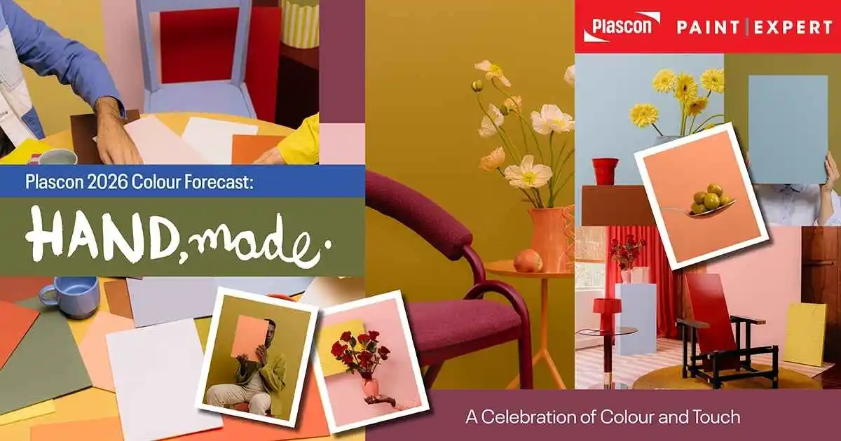
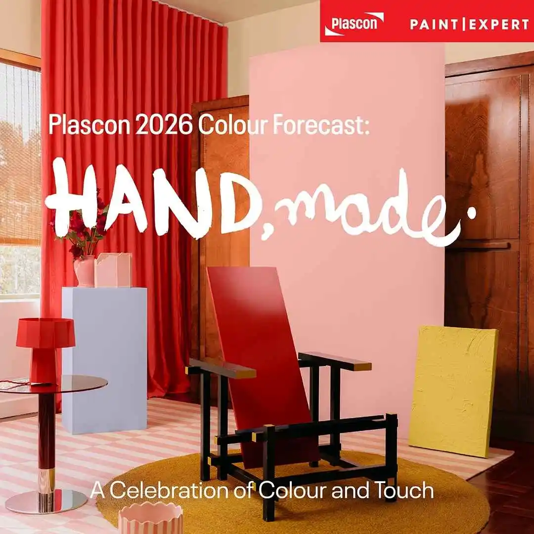
Unlock the power of paint with the human hand, and bring home style that feels personal, crafted and current.
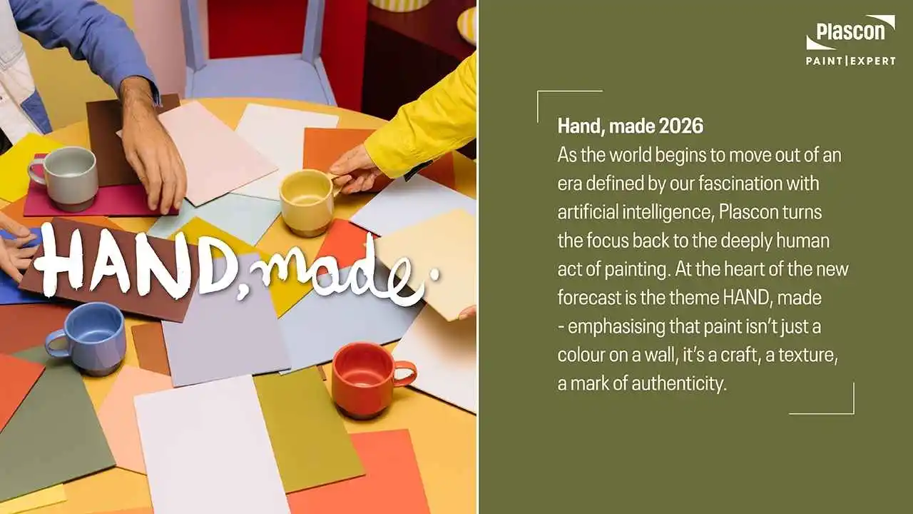
Why HAND, made? Why 2026?
As the world begins to move out of an era defined by our fascination with artificial intelligence, Plascon turns the focus back to the deeply human act of painting. At the heart of the new forecast is the theme HAND, made – emphasising that paint isn’t just a colour on a wall, it’s a craft, a texture, a mark of authenticity.
The 2026 forecast introduces four colour “worlds” inspired by nature and daily life, rooted in the idea that surfaces respond to our touch, our spaces, our stories.
This article is your guide to these four worlds, with curated colour picks and expert design-tips. Whether you’re an interior designer, architect, contractor, DIY home-owner, or simply someone looking to refresh their home, you’ll find inspiration, practical advice and motivation to visit your nearest authorised Plascon Paint Expert store for expert service, colour matching, and professional finishes.
What’s new in 2026?
- A shift away from purely high-tech, digital aesthetics, towards texture, craft and the human hand.
- Four distinct palettes (or “worlds”) that balance earthy, tactile tones with expressive brights and rich contrasts.
- Colours drawn from the existing Plascon library, curated to reflect mood, movement and meaning, rather than brand-new experimental hues.
- Intent to inspire real-world application: walls, ceilings, furniture, trims – all available from your local authorised Plascon Paint Expert store.
The Four Worlds of Colour
- Butter + Sky
In this palette you’ll find warm, uplifting tones and serene sky-blues that invite calm optimism into a space. The key colours include:
- Chocolate Chunk (O2-D1-1)
- Blazing Sun (Y4-A1-4)
- Sapphire (B7-A1-1)
- Athena’s Dream (B4-A2-1)
- Cave Painting (O2-C1-1)
- Julia (Y3-A2-2)
- Signal Red (G7)
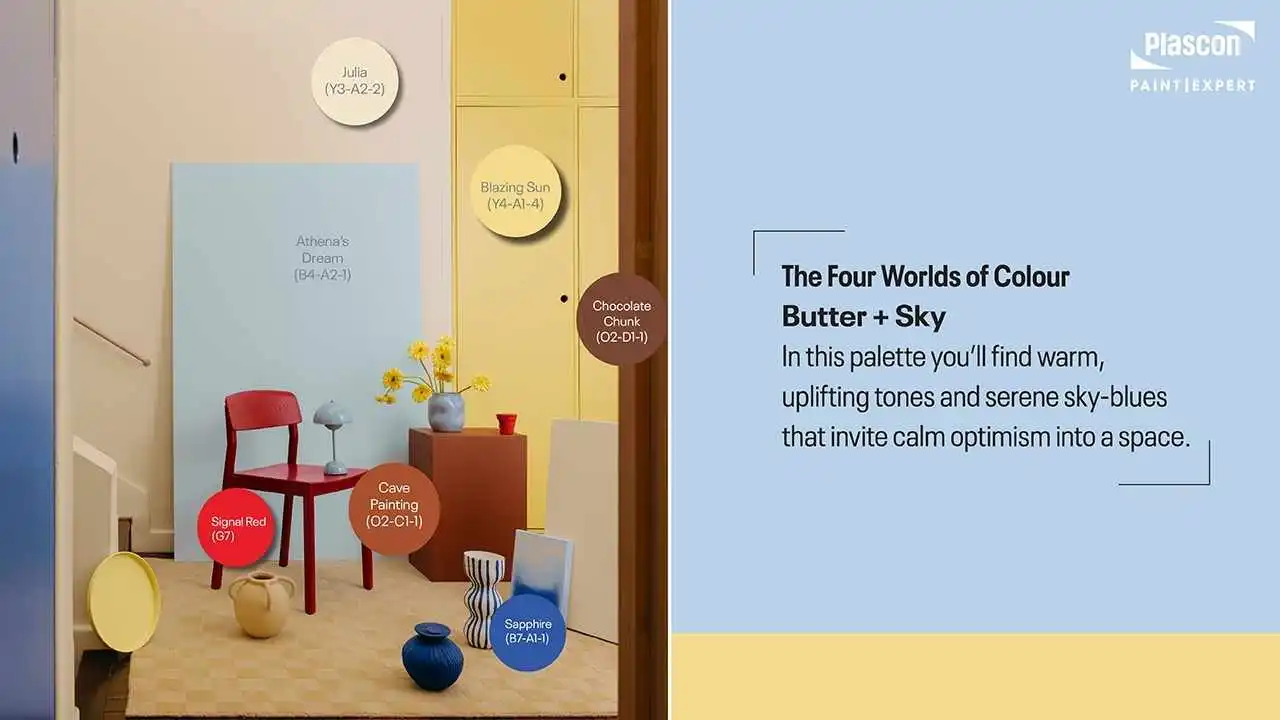
Expert Tip: Use this palette for open-plan living spaces, creative studios or bedrooms where you want a sense of uplift. Pair light wood flooring, natural linen fabrics and matte textures to enhance the tactile feel. A Signal Red accent wall draws attention to a feature piece – perhaps a built-in shelf or an art display.
- Land + Sea
Rooted in earthy textures and water-inspired hues, this palette channels calm, natural living with a subtle richness. Colours include:
- African Mud (O2-E1-1)
- Olive (G2-E1-2)
- Frog Pond (Y6-D1-1)
- Bashful Blue (B3-C1-4)
- Sparkling Lemon Lime (Y6-A1-1)
- Daily Lily Dream (O2-A1-1)
- Evening Stroll (G6-C2-1)
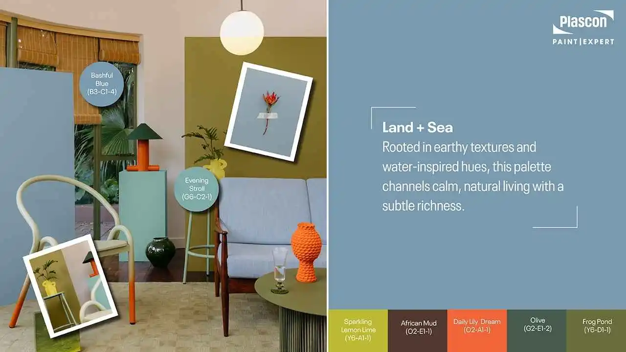
Expert Tip: Ideal for bathrooms, kitchens, or relaxation zones where you want to blend indoor and outdoor sensibilities. Match with stone-or-slate tiles, woven textures and plants to reinforce the nature-led vibe. Use Sparkling Lemon Lime as a subtle pop of energy against a base of Olive or African Mud.
- Fashion + Candy
This vibrant and eclectic palette is inspired by street style, youth culture and bold expression. Colours include:
- Eclair (R7-D1-1)
- Ruby Tuesday (R5-B2-2)
- Bellagio Blue (B6-B2-1)
- Hot-N-Spicy (R6-B1-1)
- White Maas (Y2-A2-2)
- Lemon Essence (Y5-A1-2)
- Ginger Biscuit (O1-C1-1)
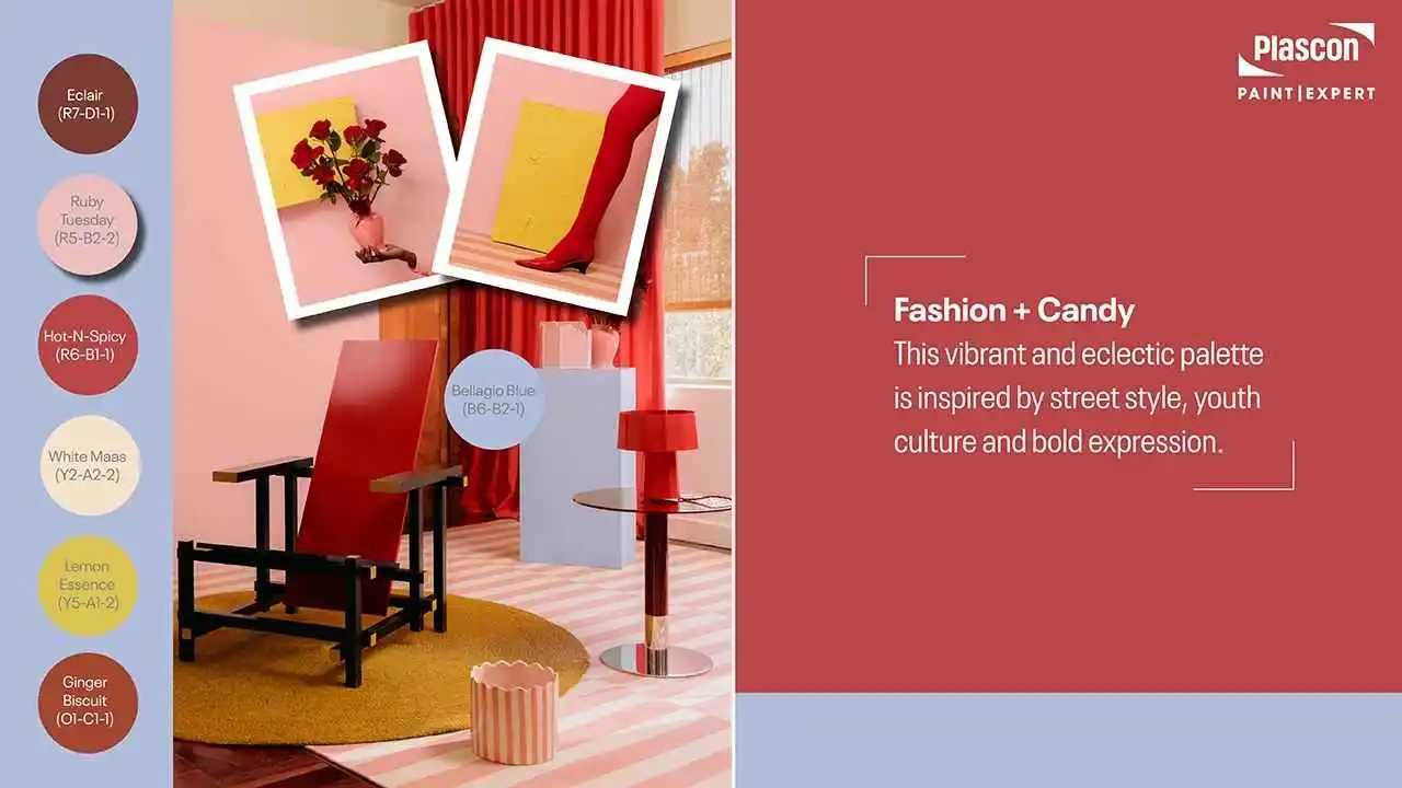
Expert Tip: Use this palette where you want personality and vibrancy – children’s rooms, feature walls, funky offices or retail spaces. For example, a Lemon Essence furniture piece against a Ginger Biscuit wall, topped with Ruby Tuesday accessories, creates dynamic layering. Keep surrounding finishes neutral to let the colour do the talking.
- Orchard + Blooms
Lush, vibrant and full of vitality, this palette evokes garden centres, fruit markets and nature’s abundance. Colours include:
- Chocolate Delight (R6-E1-1)
- Hudson (26)
- Spanish Brocade (O2-B1-3)
- Swazi (R2-C1-1)
- Wanda (Y4-C1-1)
- Good Day Sunshine (O6-A1-1)
- Just Terracotta (R7-C1-1)
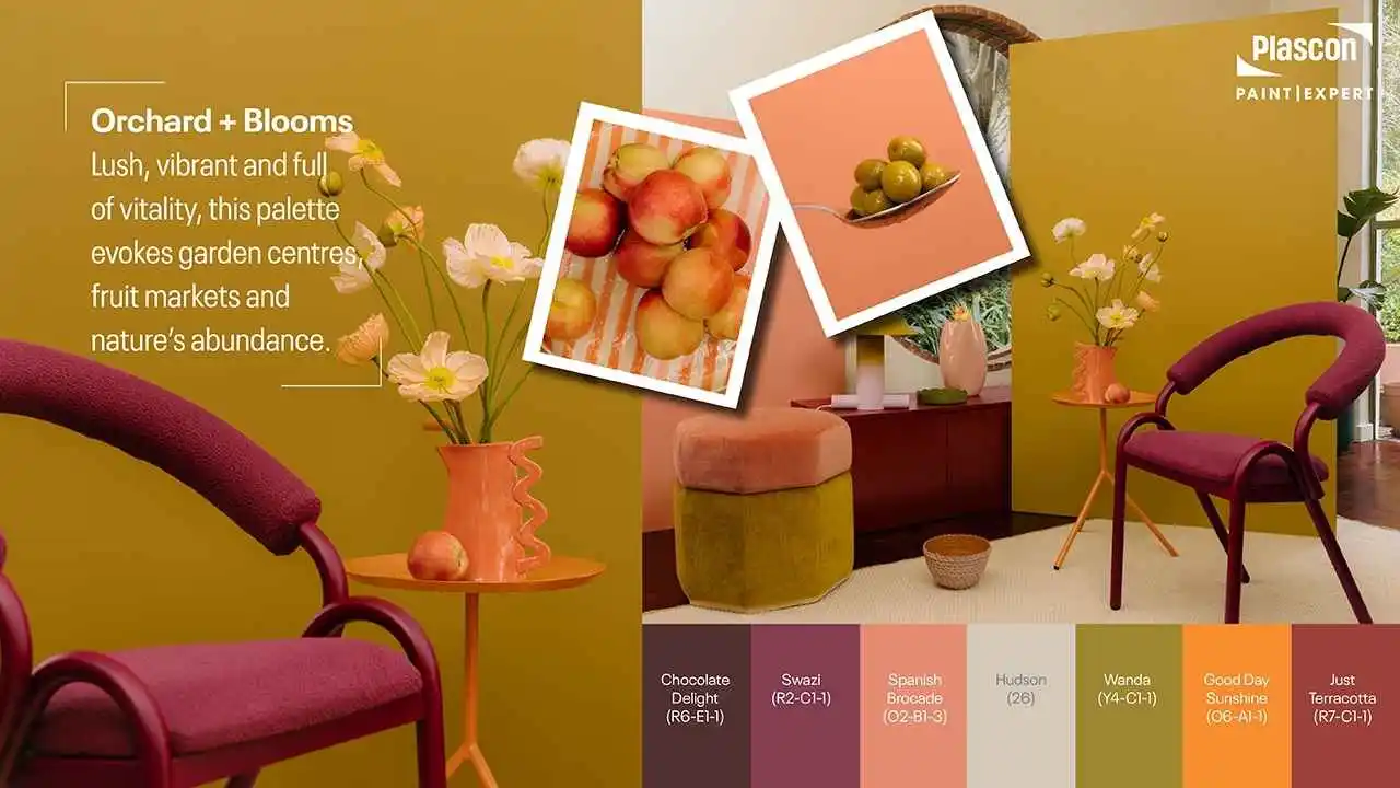
Expert Tip: Perfect for kitchens, garden-rooms, dining areas and communal spaces where you want warmth, social energy and texture. Pair with terracotta tiles, wicker furniture and leafy plants. Just Terracotta on a sofa wall with Good Day Sunshine accessories helps evoke sunny, harvest vibes. For a polished twist, let Spanish Brocade serve as trim or cabinetry colour.
How to Use the Forecast in Your Space
- Select your mood first: Are you seeking optimism (Butter + Sky)? Calm and natural (Land + Sea)? Bold fun (Fashion + Candy)? Or vibrant community (Orchard + Blooms)?
- Pick a dominant colour + accents: Choose one base wall or area to anchor your palette, then two-three accent tones from the same world.
- Sample before you commit: Visit your authorised Plascon Paint Expert store, grab the Plascon “Perfect Colour Testers” and apply small swatches in your actual lighting.
- Finish matters: Depending on room use (high traffic vs low), select the appropriate Plascon coating (matt, eggshell, satin).
- Coordinate surfaces: Paint interacts with flooring, furnishings and fabrics. For example, in Land + Sea, a muted Olive wall might rest beautifully against raw timber and jute fabrics.
- Don’t forget trims & ceilings: Using a complementary tone from the same palette on trims/doors creates cohesion. A subtle tone from Butter + Sky on skirting is more elevated than a stark white.
- Limit and focus: Especially in smaller rooms, one strong accent combined with a neutral from the same palette prevents a “chaotic” result.
Expert tip: When you visit your Paint Expert store, bring along interior photos (mobile phone), swatches and piece of furniture. Our trained staff can help match the right finish, advise on coats and suggest coordinating trims / doors for seamless adoption of the trend.
Explore more Hand, made. Inspiration by visiting https://www.plasconcolour.co.za/ or download the 2026 brochure:
Why Buy at an Authorised Plascon Paint Expert Store?
- Expert colour-matching and tinting services to the exact Plascon codes.
- Professional advice on surface preparation, application and finish.
- Access to full spectrum of Plascon products (interior, exterior, primers, special finishes).
- Confidence in warranty and genuine product authenticity.
- Inspiration boards and merchandising of the 2026 forecast zones so you can see real-life examples.
FAQs – Your Painted Questions Answered
Q1. Are the 2026 colours only for new builds?
Not at all. These palettes can work in renovation projects, feature walls, furniture refreshes and full-room repaints. The goal is expression, not only new homes.
Q2. How many litres will I need for a large open-plan area?
That depends on wall area, number of coats, surface type and product choice. Your Plascon Paint Expert store can use a Paint Calculator tool to help you gauge how many litres you’ll need.
Q3. Can I use exterior-grade Plascon paint inside?
It is always best to use the correct product for the correct application. For interior use choose the designated Plascon interior top-coats. Exterior products are formulated differently for UV and weather resistance. Always ask your store for the right type.
Q4. What if I’m unsure of the colour in my light?
This is where the “Hand, made” concept comes in. Sample it. Use a Plascon tester pot on a wall, live with it for a day (natural light, evening light) before committing. Swap out if it doesn’t feel right – authenticity is built in.
Q5. Can I mix colours across the four worlds?
Yes you can, but we recommend staying primarily within one world to maintain cohesion and tone. If mixing, pick one dominant palette and then borrow one accent from another world for a playful twist.
In Conclusion
The Plascon 2026 Colour Forecast, HAND, made, invites you to make spaces that speak of craftsmanship, texture, personality and mood. Whether you’re a specifier, professional designer, or an enthusiastic DIYer, these four world-palettes give you a framework to explore, interpret and apply colour with confidence.
If you loved past colour stories such as Embracing Hybridity: Plascon’s Visionary 2025 Colour Forecast, you’ll recognise the same expert insight and proudly South African creativity in this year’s forecast. Each palette connects deeply to how we live, work, and create, celebrating the return of the human hand in design.
Visit your nearest authorised Plascon Paint Expert store today. Pick your palette, sample the tones and let the human touch of paint transform your space.
It’s about your hand, your mark, your home.
